

Pravar

2023–PresentGrowth Design, Content Systems & Framer

Website Transformation

The product had moved on. The website was still describing the old one, and every change to it waited on a handoff. I moved LinkedPhone's website to Framer, rebuilt its structure and content system, and made publishing something design does.

Live at linkedphone.com

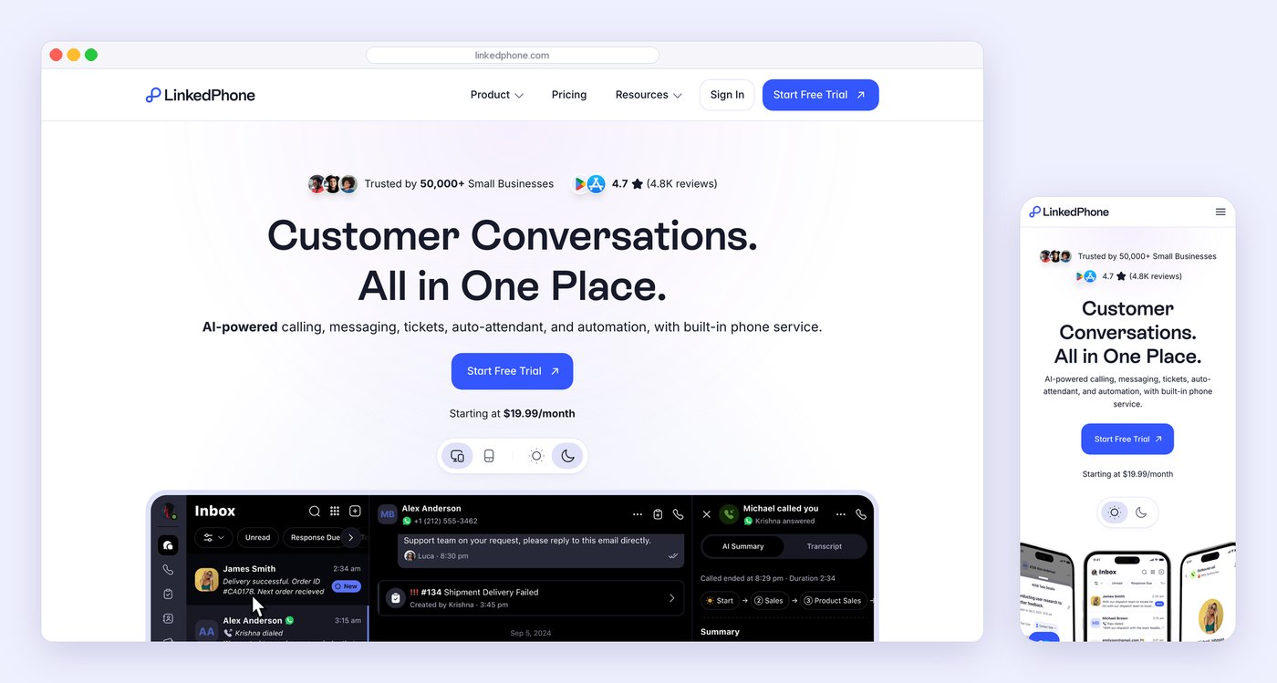
The new LinkedPhone homepage in a browser window, and the same page on a phone beside it: Customer Conversations. All in One Place., a Start Free Trial button, and the real LinkedPhone inbox.
Live today
500+
Pages redesigned, rebuilt and restructured
98%
Less engineering dependency: design publishes
3m 58s
Average session, sitewide, since launch
1 → 7
One module template, seven product pages

The 1-minute overview

Two companies, one URL.

A customer landed on the website and met one company. They signed up and met another. The product, the brand, the design system and the AI had all moved on. The website was the last piece still describing the old LinkedPhone, and the way it got built was the reason it had stayed that way.

My role
I set the direction: proposed Framer as the publishing pipeline, made the case for it, and built the MVP page that proved it. I designed the homepage and every main narrative page, led the design of the search pages, and conceived the CMS strategy. A junior designer on my team helped build the CMS collections.
The key decisions
Make the design the build. Structure the site from a product hub out, but present it from the homepage in. Build every page from a section schema, context before feature. Back every claim with a preview that moves. Put a live Lisa demo on every page. Automate the repetitive pages with a CMS.
What came out
A 500+ page website on Framer: one homepage, a product hub, seven module pages from one template, CMS families for numbers and the blog, and Lisa as a voice demo on every page. Visitors stay for almost four minutes on average.

Before → After · The homepage

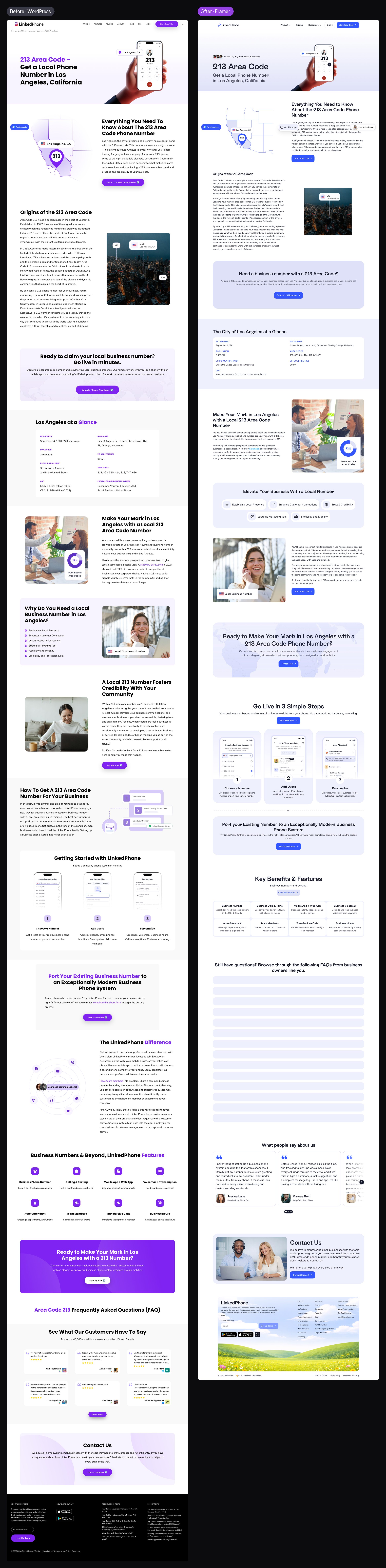
Left, the old LinkedPhone homepage on WordPress: a laptop and phone mockup beside the headline Local and Toll-Free Business Phone Numbers, with Try For Free and Request A Demo buttons and a seven-link menu. Right, the new homepage on Framer: Trusted by 50,000+ small businesses, the headline Customer Conversations. All in One Place., one Start Free Trial button, and the real LinkedPhone inbox below.
The first screen, before and after. Left: a laptop with a houseplant on it and two buttons of equal weight. Right: one action and the actual product, in a system design can change the same day. Open it to see both homepages at full length.

See the six decisions behind it

The 5-minute story · Six decisions

Rebuild the system that makes the pages, not just the pages.

The obvious brief was a redesign. But a redesign built through the same chain of handoffs would have been out of date within a year, because the product was changing faster than that chain could move.

So the work was about systems: how pages get built, how they're organised, what goes into each one, how they prove what they say, how a visitor can try the product without signing up, and how hundreds of near-identical pages stay in step.

01 Publishing pipeline

Make the design the build.

Every change to the old site travelled from marketing to design to a developer and back for review, and picked up drift at every step. I proposed moving the whole website to Framer, where what design builds is what gets published, with motion made in Jitter alongside it.

It was a big bet, so I proved it on one page first: the App Update page for the redesigned app. It held visitors for more than three minutes on average, and the migration followed.

Before

  1. MarketingAsks
  2. DesignDraws
  3. HandoffSpecs & notes
  4. DevelopmentRebuilds
  5. ReviewChecks the drift

After

  1. IdeaA page worth making
  2. DesignIn Framer
  3. MotionIn Jitter
  4. BuildStill the design
  5. PublishSame day

Engineering dependency on the website fell by 98%.
02 Information architecture

Build from the product hub out. Present from the homepage in.

There was far more to say about the product than one page could hold. So the site is built around a product hub (L0) that holds everything, comparison included. The homepage (L1) is the story version of that hub for someone new, and each module page (L2) goes deep on one part of the product.

Visitors meet it in the opposite order: homepage, then the module they care about, then the hub when they're ready to compare. Searchers land on number pages and blog posts and join the same path.

Structure · Built vs visited
How the site is built, and how it is visitedTop, how it is built: level zero is the product hub, which holds every module, feature and the comparison; level one is the homepage, the hub told as a story; level two is seven module pages from one template. Bottom, how it is visited: homepage, then a module page, then the product hub, then a free trial.HOW IT’S BUILTL0Product hubEverything, including the comparisonL1HomepageThe hub, told as a storyL2CallingMessagingAuto AttendantTicketsAI ToolsAI ReceptionistMobilitySeven module pages, one templateHOW IT’S VISITED1Homepage2A module3Product hub4Free trialSearchers land on a number page or a post, and join at step 2.
The same site read two ways. Left: everything derives from the hub. Right: the order a visitor actually meets it.

One structure for the system, another for the visitor, and a menu that connects them.

03 Content strategy

Build every page from a section schema, context before feature.

Before any page was designed, each level got a schema: which sections it has, in which order, and what each holds, down to three points of 60 to 80 characters and one testimonial per section. The second half of the homepage and the All Features page are the same nine sections, written once.

One rule runs through all of it: never lead with the feature. Every section opens on the visitor's situation and the problem it causes, and reveals the feature as the answer.

Content schema · L1, All Features & L2
Three page types, one vocabulary of sectionsThree pages drawn as columns of sections. Homepage: hero, three reasons, five product sections, then a shared back half of nine sections. All Features: hero, three reasons, feature sections and a comparison, then the same shared back half. Module page, used seven times: hero, three reasons, three sections, proof in action, then FAQs and links onward. Rules: three points per section, 60 to 80 characters each, one testimonial per section, eight FAQs.HomepageHeroThree reasonsFive product sectionsShared back halfAll FeaturesHeroThree reasonsFeature sectionsCompareShared back halfModule page × 7HeroThree reasonsThree sectionsProof in actionFAQs · DiscoverThe shared back half is nine sections, from Download the app to FAQs, written once for both pages.CONTENT RULES3 points, +1 optional60–80 characters a pointOne testimonial a sectionEight FAQs
The schema, redrawn. The dashed band is shared: change it on one page and the other follows. Show original opens the working document.

The rules came first, so the pages could be many without being different.

04 Visual language

Back every claim with a preview that moves.

The old site showed laptops, desk phones and stock photos. The new one shows the product, and almost every preview carries a short motion graphic I made in Jitter that acts out the sentence next to it.

The Auto Attendant fold, recorded from the live homepage: "Press 1 for Sales", acted out.

A promise on the page is followed, a second later, by the product keeping it.

05 Product as the demo

Let the product demo itself.

A small Lisa Voice Demo pill sits in the corner of every page. Tap it and you're on a real call with Lisa, in the browser, no sign-up. It does two jobs at once. Visitors hear exactly what their own callers would: her voice, the audio quality, how natural the conversation feels. And Lisa knows LinkedPhone, so they can ask her anything about the product, its features or its price.

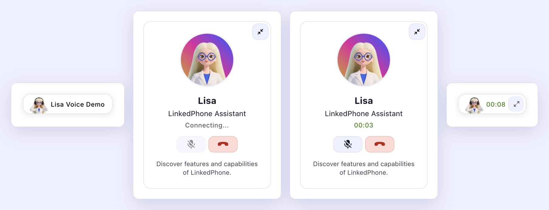
Lisa Voice Demo · Four states

Four states of the Lisa Voice Demo widget: a small pill with Lisa's avatar reading Lisa Voice Demo; a card with Lisa's portrait, LinkedPhone Assistant, Connecting..., mute and hang-up buttons and the line Discover features and capabilities of LinkedPhone; the same card on a live call at 00:03; and the call minimised to a small pill with a running timer.
The pill, the call connecting, the call live, and the call minimised to a timer so the visitor can keep browsing while they talk.

The best pitch for an AI receptionist is a conversation with one.

06 CMS

Automate the repetitive pages.

Most of the site's pages are near-copies: an area code, a state, a city, a toll-free prefix, a blog post. I designed each family as one CMS template and a collection of entries, so the content is data and the design is written once. Fix the template and hundreds of pages change with it.

Before → After · One of 85 area-code pages

Left, the old 213 area code page for Los Angeles on WordPress, with a phone illustration and a long block of text. Right, the new 213 area code page on Framer: a map of California with Los Angeles marked, and a structured introduction.
The 213 area-code page, before and after: one entry in a collection of 85, beside 60 state and 59 city pages built the same way.

Hundreds of pages, a handful of templates, and nothing for engineering to do.

What the work produced

A website design can publish, and keep publishing.

More than 500 pages on Framer, built from a three-level structure, a section schema and a set of CMS templates, in the same design language as the product. Since launch the average session has been 3 minutes 58 seconds, and it hasn't dropped below 3 minutes 45 seconds.

My contribution: closing the distance between designing a page and publishing it, then giving the site a structure and a content system that let it grow without falling behind again.

The live site · linkedphone.com

The new surface, in motion.

The homepage folds, recorded from the live site. Every preview carries a Jitter motion graphic that acts out its sentence, and most respond to hover.

Calling: a business line, on every device.
Lisa, the AI receptionist, in three steps.
Auto Attendant: the call menu builds itself.
Tickets, from a message to a task.
AI tools: summaries and replies that write themselves.
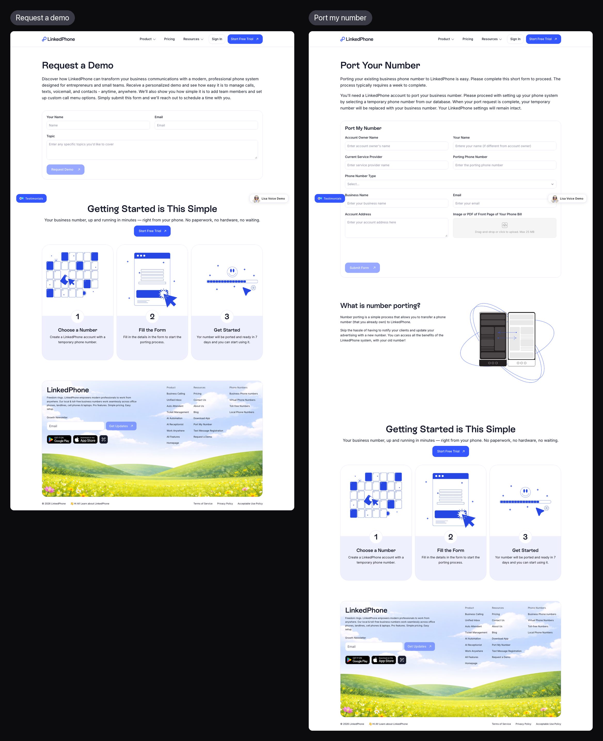
Go live in three steps, or bring your number.

The complete case study · 15 minutes

From a website someone else built to one design could publish.

Eight chapters, in the order the work happened: the problem, the gaps behind it, the page that settled the platform, the structure, the content strategy, the pages, the motion, and the CMS that let design ship at scale.

Chapter 01

The Old Website

Everything inside the company had changed. The website hadn't.

For almost two years, LinkedPhone changed everywhere at once: the product, the navigation, the design system, the brand, the way it thought about AI. Auto Attendant was rebuilt. Lisa, the AI receptionist, was on her way.

The website was still a WordPress site from an earlier LinkedPhone. It wasn't broken. It was accurate about a company that no longer existed, and it was the first thing every new customer saw.

The company had already transformed.

The website simply hadn't caught up.

The audit

A homepage that had grown one section at a time.

I went through the old site page by page before designing anything. Each homepage section had its own layout, length and tone. A laptop, a desk phone and a houseplant stood in for the product. Eight features sat in eight identical tiles. The footer was a list of blog links where the site's structure should have been.

The old homepage The first screen of the old LinkedPhone homepage: a laptop and a phone mockup with a houseplant beside the headline Local and Toll-Free Business Phone Numbers, with Try For Free and Request A Demo buttons.
The old homepage's first screen. Open it to scroll the whole page.

Every other page

Every page, designed on its own terms.

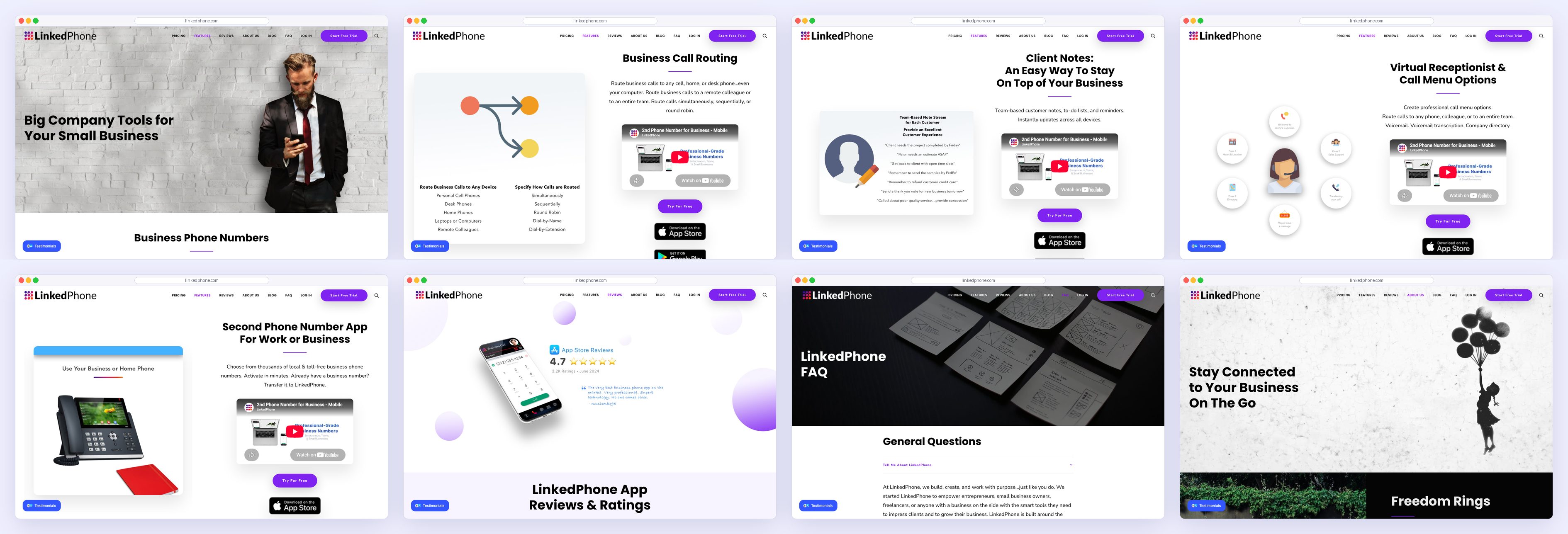
Features were explained in long search articles of 2,000 words or more. Around them sat Reviews, FAQ and About pages, a pricing page, and 107 blog posts published at the root of the site, indistinguishable by address from the product pages.

The old site · Eight more first screens The first screens of eight old pages: Features with a stock photo of a man on a phone, Call Routing, Client Notes CRM, Virtual Receptionist and Call Menu Options, the Second Phone Number app page, Reviews and Ratings, FAQ, and About Us.
Features, Call Routing, Client Notes, Virtual Receptionist, the second-number app, Reviews, FAQ and About: each designed on its own terms.

Chapter 02

Three Gaps

Not one problem with the website. Three, and only one of them was visual.

Gap 01 · Structural

The product had modules. The site had no place for them.

Drawn as a tree, the old site was almost flat. Everything hung off the homepage at the same level: company pages, one page of feature tiles, six long articles, 107 blog posts and a few hundred number pages. There was no level for the product itself, so there was nowhere obvious for anything new to go.

Gap 01 · The old site, as a tree
The old site had no product levelThe old site drawn as a tree: the homepage links flatly to company pages, one Features page of about thirty equal tiles, six long feature articles, 107 blog posts at the root of the site, and about 220 number pages. There is no level for the product.Homepage7Company pages1Features page, about thirty equal tiles6Long feature articles107Blog posts at the root~220Number pagesThe product,scattered.
The old structure. The dashed groups are where the product was being explained, scattered across a tile page, long articles and blog posts.

Gap 02 · Visual

The website and the product looked like two companies.

Set the old website's first screen beside the product it was selling and the gap is plain. The product had moved to a calm system of clear type, lavender surfaces and real states. The website was still selling with device mockups, heavy display type and an older palette.

Gap 02 · The website against the product
The website against the productLeft, the old website's first screen with four outlined problems: the logo and palette, a headline selling a phone number, two calls to action of equal weight, and a laptop and houseplant standing in for the product. Right, the product itself, as the new website now shows it.THE OLD WEBSITETHE PRODUCT1234Calm type, lavender surfaces,real states.1An older logo and palette2A headline selling a number3Two actions of equal weight4Devices in place of the product
The old website's first screen with four problems outlined, beside the product as the redesigned site now shows it.

Gap 03 · Operational

Every change waited on a handoff.

Designers designed and developers implemented, so every update travelled the same chain and picked up drift on the way. Working through changes with the people who built the old site, the same four problems kept coming back.

How a change travelled

  1. MarketingAsks for a change
  2. DesignDraws it
  3. HandoffSpecs, files, notes
  4. DevelopmentRebuilds it
  5. ReviewChecks what drifted

01

The bottleneck was distance, not tooling.

Every handoff added days, whichever tool sat in the middle.

02

Every handoff introduces drift.

Spacing, copy and colour shifted a little at each translation from file to page.

03

The reasoning didn't survive.

Why a section came where it did lived in the designer's head, not in what the builder received.

04

Every page re-asked the same questions.

What goes in the hero, where proof sits, how a section ends. Answered once as a system, every page gets easier.

What this changed

We thought we needed a better website.

We needed a better publishing system.

Chapter 03

One Page First

Before moving 500 pages, prove the approach on one.

The platform question

The real question was how the website gets built.

I judged three options by one thing: how far each put the design from the published page.

WordPress

Why it looked right: stable, established, and what the site already ran on.

Why it fell short: heavy implementation for every change. The design still had to be rebuilt by someone else.

Too slow

Bricks Builder

Why it looked right: far more creative freedom inside WordPress, better layouts, real control.

Why it fell short: someone still had to build what was designed. A new tool, the same gap.

Better, still blocked

Framer

Why it looked right: close to Figma, so the design could become the implementation.

Why it won: design could build, publish and iterate on its own, with a CMS for pages that repeat.

Chosen

The test

One small page decided the migration.

Moving a whole website to a new platform was a real risk, and it was my proposal. So rather than ask for the migration, I built one page in Framer first: the App Update page announcing the redesigned app to existing customers, with what changed, a timeline of what was coming, and plain answers about data and price.

It held people for an average of more than three minutes, on a page built to explain rather than to convert. That result made the case better than any deck, and the company agreed to move hundreds of pages onto the same approach.

The MVP · The App Update page The first screen of the App Update page: Meet the All-New LinkedPhone, Faster, Smarter and Beautifully Modern, with three phones and a Start Free Trial button.
The MVP page, as it lives on the site today. Open it to scroll the whole page.

Design stopped being preparation.

It became production.

Chapter 04

The Architecture

Solve the structure once, and every page after it inherits the answer.

Levels

The hub is the foundation. The homepage is the front door.

With the platform settled, the next question was where everything lives. LinkedPhone has more to explain than any page can carry, so the structure has two orders. In the system, the product hub is level zero: the complete description of the product, comparison included, from which everything else derives. The homepage is level one, a guided overview of the hub for someone new. The seven module pages are level two.

For the visitor, the order flips: homepage, then the module that matches their problem, then the hub when they want everything side by side before deciding. The comparison is there for that moment; it doesn't need to lead.

Structure · Built vs visited
How the site is built, and how it is visitedTop, how it is built: level zero is the product hub, which holds every module, feature and the comparison; level one is the homepage, the hub told as a story; level two is seven module pages from one template. Bottom, how it is visited: homepage, then a module page, then the product hub, then a free trial.HOW IT’S BUILTL0Product hubEverything, including the comparisonL1HomepageThe hub, told as a storyL2CallingMessagingAuto AttendantTicketsAI ToolsAI ReceptionistMobilitySeven module pages, one templateHOW IT’S VISITED1Homepage2A module3Product hub4Free trialSearchers land on a number page or a post, and join at step 2.
Left, how the site is built; right, how it's visited. The search layer is templated separately and feeds visitors into the same path.

Navigation

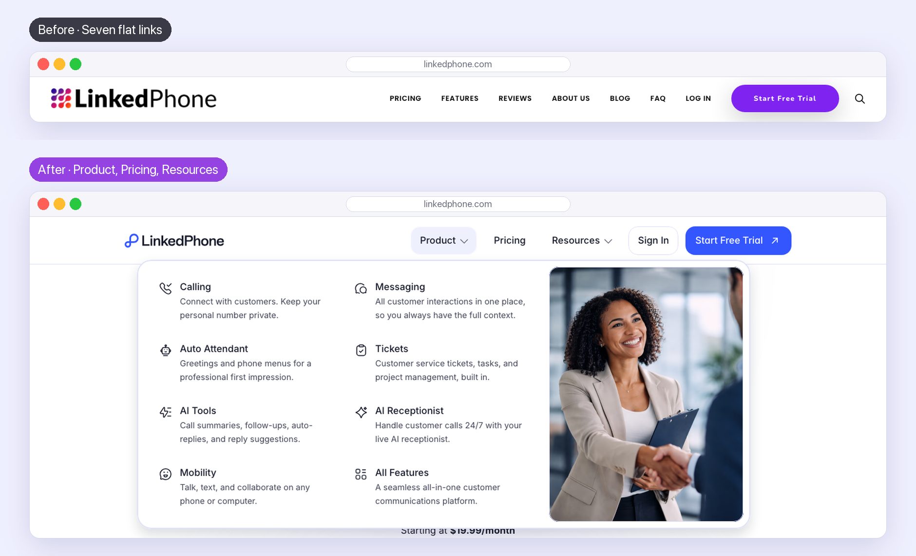
The old menu listed the company's pages. The new one is the structure made visible: Product opens onto the seven L2 pages and the hub, Pricing is one page, and Resources holds everything around the product.

Before → After · The menu Top, the old menu bar: Pricing, Features, Reviews, About Us, Blog, FAQ, Log In and a Start Free Trial button. Below, the new menu with Product open as a mega menu: Calling, Messaging, Auto Attendant, Tickets, AI Tools, AI Receptionist, Mobility and All Features, each with an icon and a one-line description.
Each module gets an icon and one line, so the menu is also the shortest product tour on the site.

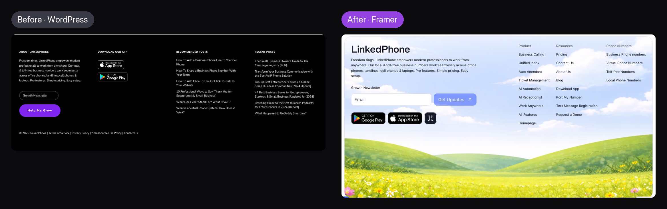
The footer followed the same logic. The old one was a black band of recent blog posts; the new one is a map of the site, organised as Product, Resources and Phone Numbers.

Before → After · The footer Left, the old black footer with About, Download Our App, Recommended Posts and Recent Posts columns. Right, the new footer with the LinkedPhone description, a newsletter field, app badges, and link columns for Product, Resources and Phone Numbers above an illustrated meadow.
From a list of blog posts to a map of the site.

Chapter 05

The Content Strategy

Decide what every section must say before designing how it looks.

The rule

Never lead with the feature.

The easy way to write a section is to open with a feature name. Ours open with the visitor: the situation they're in and the problem it causes. The feature arrives as the answer to a problem they have already recognised as their own, followed by proof. It's the rule for every page, and the copy is still tuned live against it.

Narrative rule · Context first
Context first, feature secondTwo ways to write the same section. Avoided: the feature, what it does, then why you would care. Used on every page: the visitor's situation, the problem it causes, the feature as the answer, then proof.AVOIDED · FEATURE FIRSTThe featureWhat it doesWhy you’d careUSED ON EVERY PAGE · CONTEXT FIRSTYour situationOn a job, phone ringingThe problemCallers hang upThe answerAuto Attendant routes itThe proofA real customer says so
Two ways to write the same section. The second is the one every page follows.

The homepage story

Three acts, each answering one question.

The homepage began as a content wireframe, with every block annotated with the question it had to answer before the visitor would keep scrolling. Those questions group into three acts: what this is, how it makes the day better, and whether it can be trusted. The copy changed many times after that. The order didn't.

Homepage · Three acts
The homepage in three actsThe homepage as three acts, each answering one question. Context, what is this and is it for me: hero and three reasons. Solutions, how does my day get better: calling, Lisa, inbox, auto attendant, tickets and AI tools. Confidence, can I trust it: app, trust, getting started, all features, businesses like yours, pricing, support, FAQs and a closing statement, shared with the All Features page.ACT 1 · CONTEXTWhat is this,and is it for me?HeroThree reasonsACT 2 · SOLUTIONSHow does my dayget better?CallingLisaUnified inboxAuto AttendantTicketsAI toolsACT 3 · CONFIDENCECan I trust it?App · TrustGo live in 3 stepsAll featuresBusinesses like yoursPricing · SupportFAQs · ClosingShared with the All Features page
The homepage as a story. The third act is shared with the All Features page. Show original opens the annotated wireframe it came from.

The schema

Three page types, one vocabulary of sections.

The questions became a schema for each level: which sections a page has, in which order, and what each contains. Fixed quantities keep sections complete but readable: three points, four trust items, eight FAQs. Every point is one line of 60 to 80 characters, so any point fits any layout. Every section carries proof. And the homepage and the All Features page share their back half, so one edit updates both.

Content schema · L1, All Features & L2
Three page types, one vocabulary of sectionsThree pages drawn as columns of sections. Homepage: hero, three reasons, five product sections, then a shared back half of nine sections. All Features: hero, three reasons, feature sections and a comparison, then the same shared back half. Module page, used seven times: hero, three reasons, three sections, proof in action, then FAQs and links onward. Rules: three points per section, 60 to 80 characters each, one testimonial per section, eight FAQs.HomepageHeroThree reasonsFive product sectionsShared back halfAll FeaturesHeroThree reasonsFeature sectionsCompareShared back halfModule page × 7HeroThree reasonsThree sectionsProof in actionFAQs · DiscoverThe shared back half is nine sections, from Download the app to FAQs, written once for both pages.CONTENT RULES3 points, +1 optional60–80 characters a pointOne testimonial a sectionEight FAQs
The schema, redrawn from the working document. Show original opens it as written.

Chapter 06

The Pages

The homepage first, then the seven modules, then everything around them.

How others do it

Presenting many features without overwhelming.

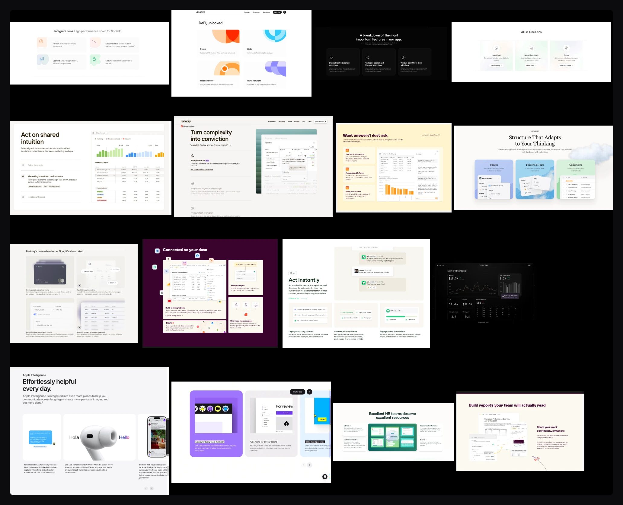
Before designing, I studied how strong product companies present a lot of capability convincingly. The pattern was consistent: one idea per block, the interface cropped close enough to read, short claims in bento grids, and previews that animate a single point. The product was the illustration, and there was a lot of quiet space around it.

Reference board A board of product sections from other companies' websites: feature cards, dashboards, integration cards, an AI answers panel, a support agent conversation and report builders.
Other companies' product sections, collected for how they frame an interface and pace a list of features.

The homepage

The homepage, section by section.

The homepage came first, section by section in the schema's order, in the same design language as the product: its type, spacing, colour and components. Every preview is a real screen of the app in a real state.

  1. Act 1 · Context
  2. HeroWhat it is, one action, the price, and the product itself.
    The homepage hero.
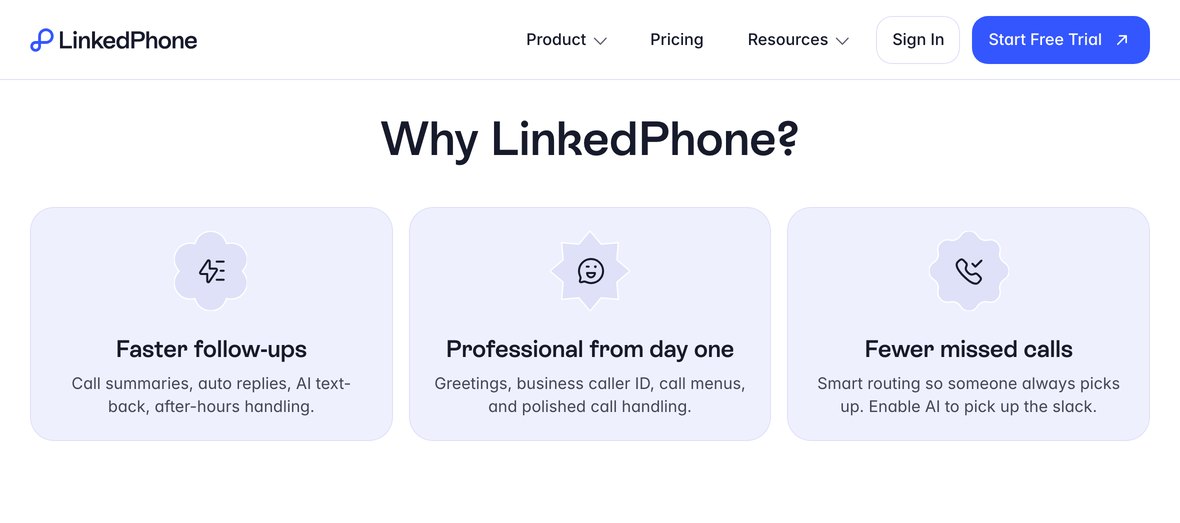
  3. BentoThree reasons, one line each: the whole pitch before any detail.
    Why LinkedPhone: faster follow-ups, professional from day one, fewer missed calls.
  4. Act 2 · Solutions
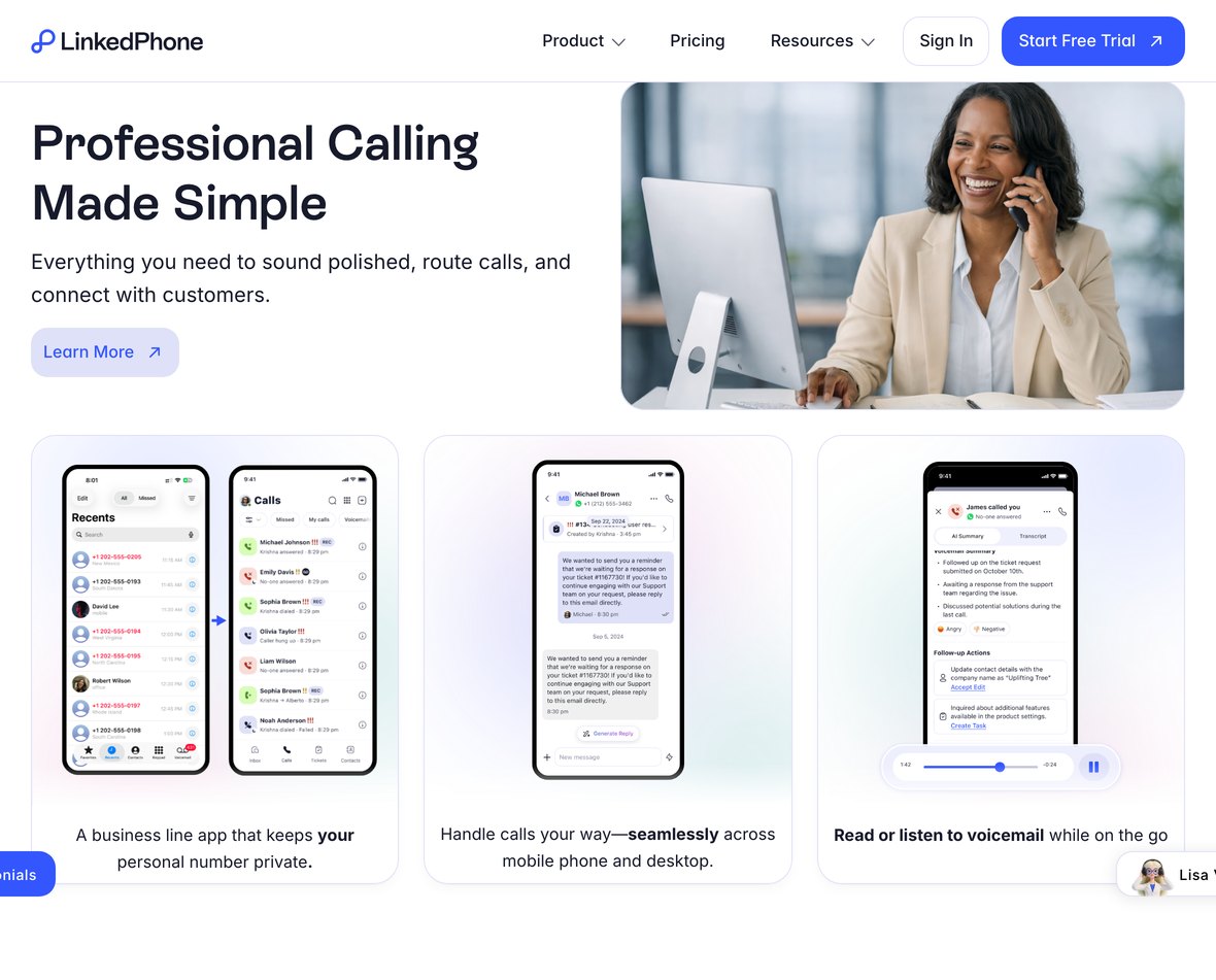
  5. CallingA private business line on every device.
    Professional Calling Made Simple.
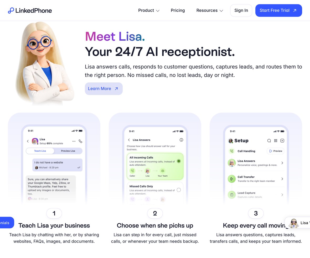
  6. LisaThe AI receptionist, in three steps.
    Meet Lisa, your 24/7 AI receptionist.
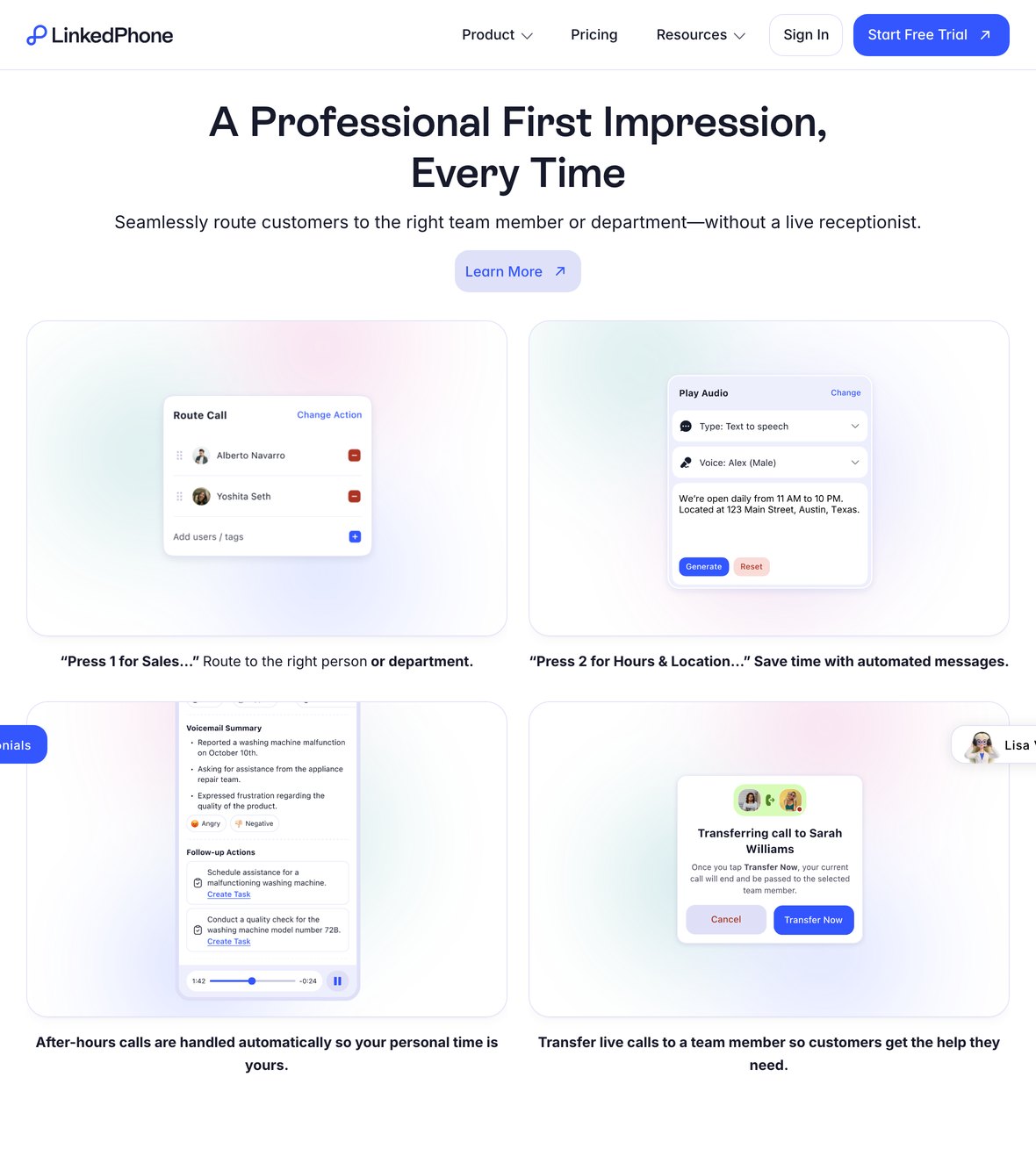
  7. Inbox · Auto Attendant · Tickets · AIFour more modules, each: context, feature, proof.
    A Professional First Impression, Every Time: the Auto Attendant section.
  8. Act 3 · Confidence · shared with All Features
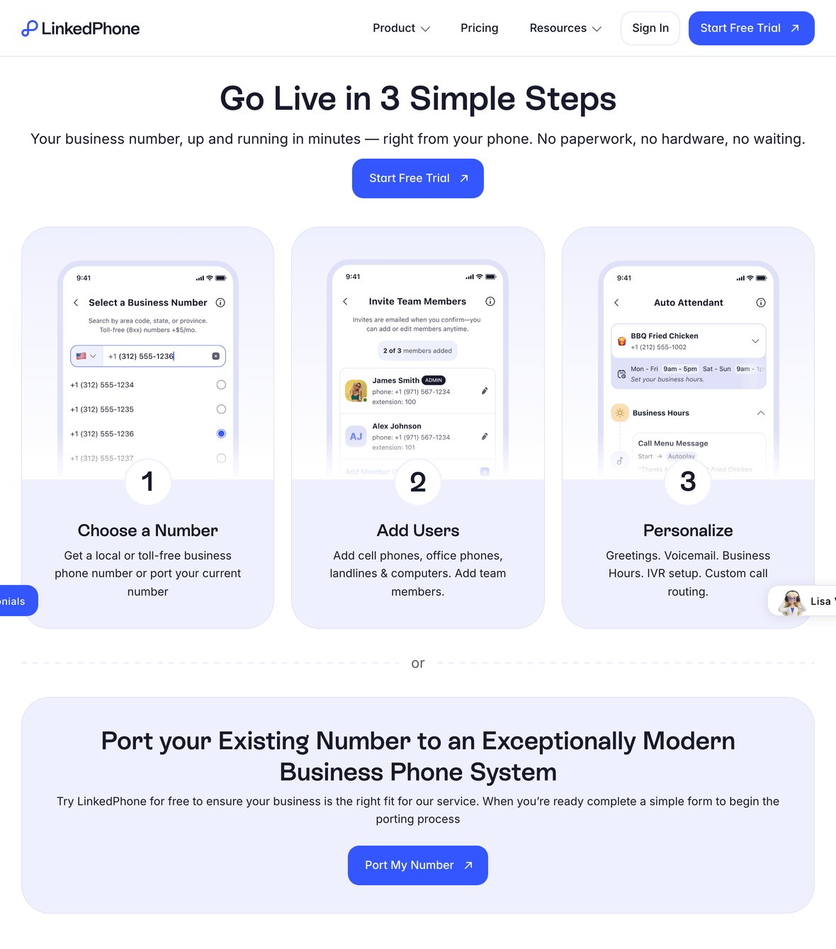
  9. App, trust & getting startedDownload the app, four trust points, live in three steps or bring your number.
    Go Live in 3 Simple Steps.
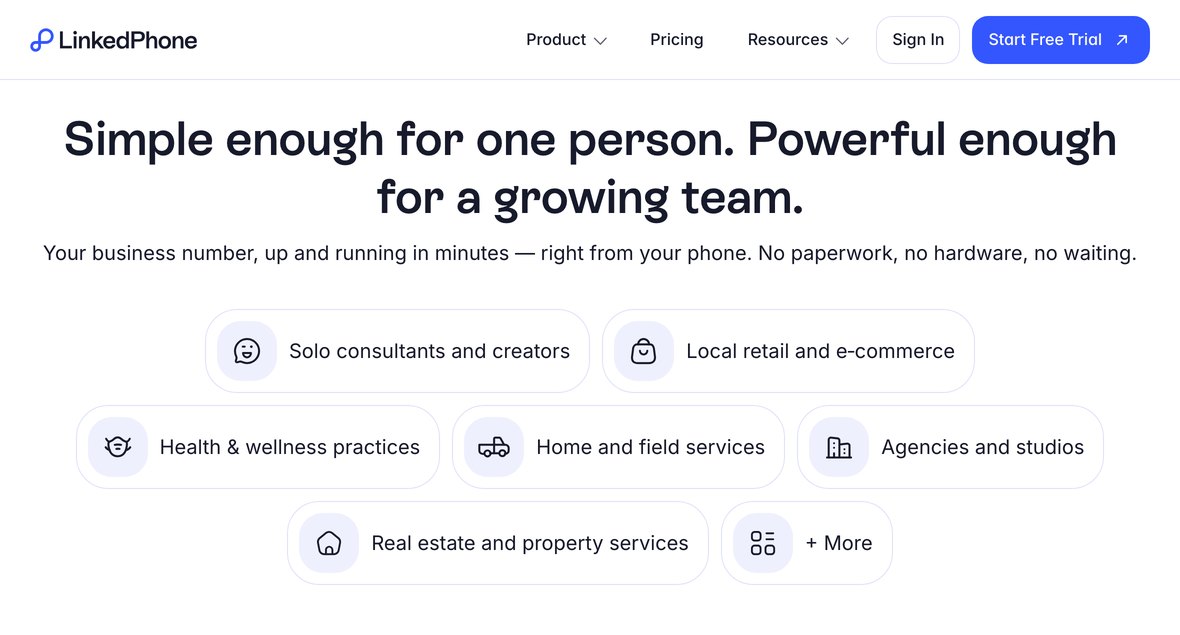
  10. All features & empathyEight features at a glance, then "a business like yours" with real reviews.
    Simple enough for one person. Powerful enough for a growing team.
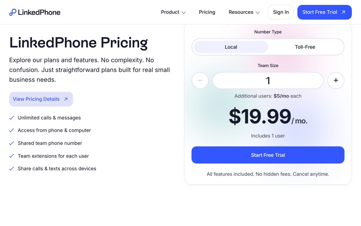
  11. Pricing, support & FAQsOne price, a human behind it, and the last objections answered.
    LinkedPhone Pricing on the homepage.
The new homepage The first screen of the new LinkedPhone homepage: Customer Conversations. All in One Place., one Start Free Trial button, and the real LinkedPhone inbox.
Open it to scroll every section in order.

Level two

One template, seven modules.

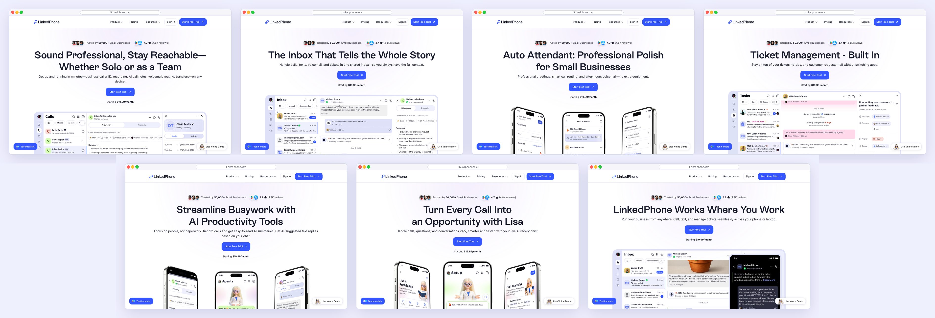
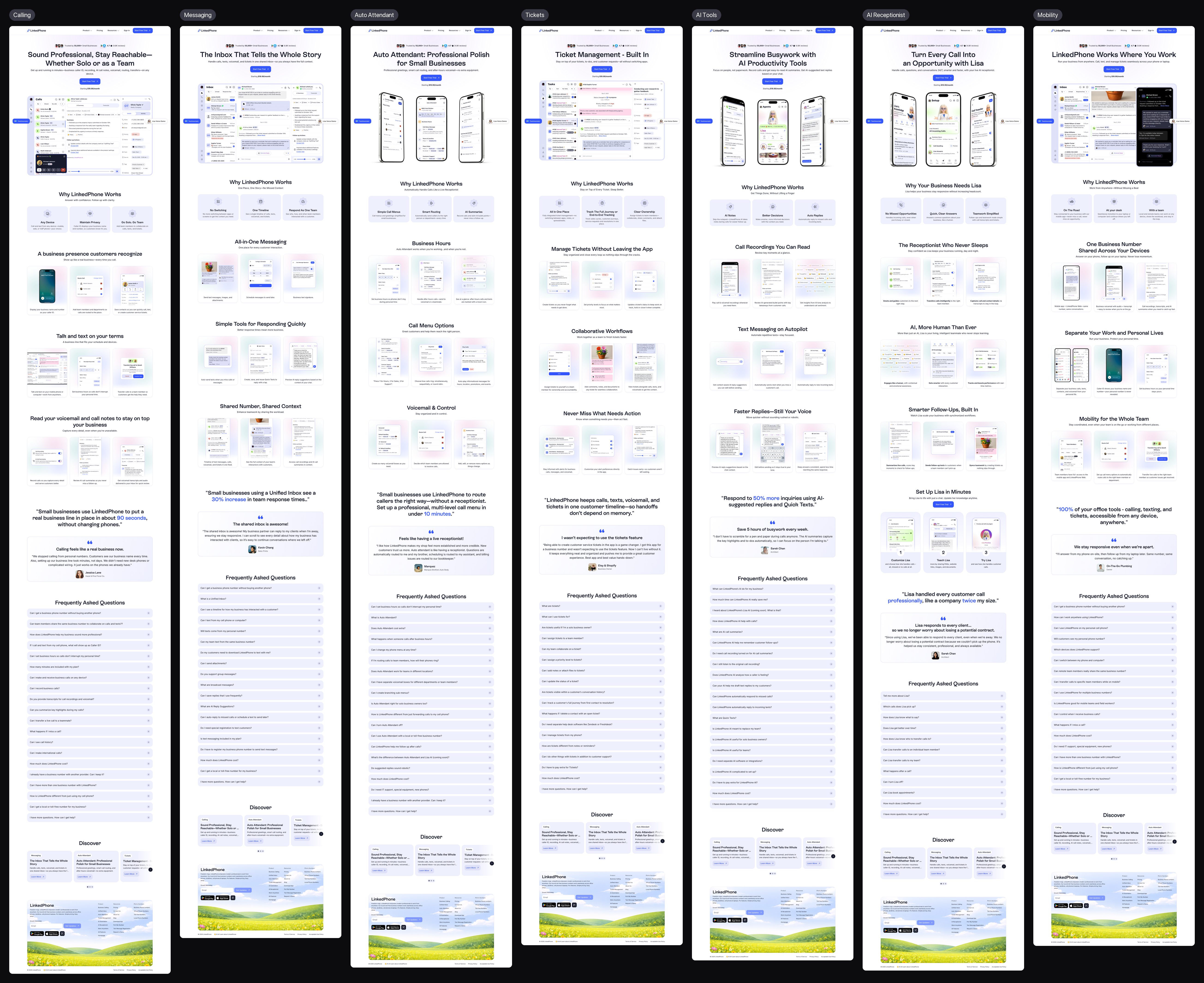
With the homepage done, the module pages followed the L2 schema: a hero with the real screens, a bento of three reasons, three sections, proof in action, eight FAQs and links to five other modules. A new module is a new set of content, not a new design problem.

All seven module pages The tops of all seven module pages side by side: Calling, Messaging, Auto Attendant, Tickets, AI Productivity Tools, AI Receptionist and Mobility, each with the same hero, reasons and feature sections.
Calling, Messaging, Auto Attendant, Tickets, AI Tools, AI Receptionist and Mobility. Open it to see all seven end to end.

Pricing

Pricing that leads with the answer.

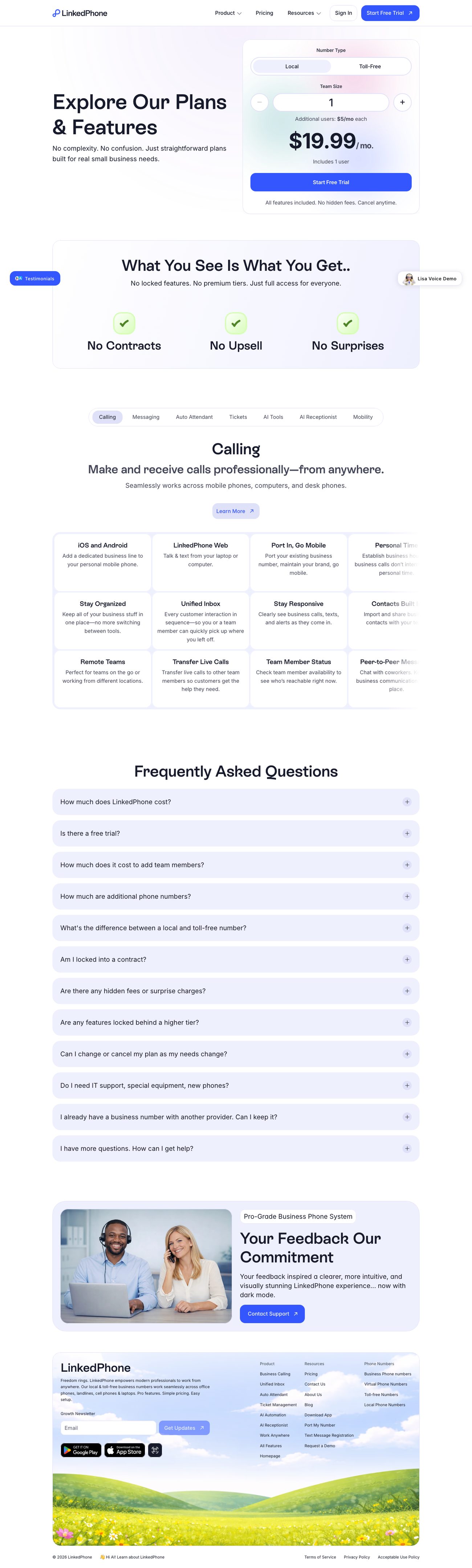
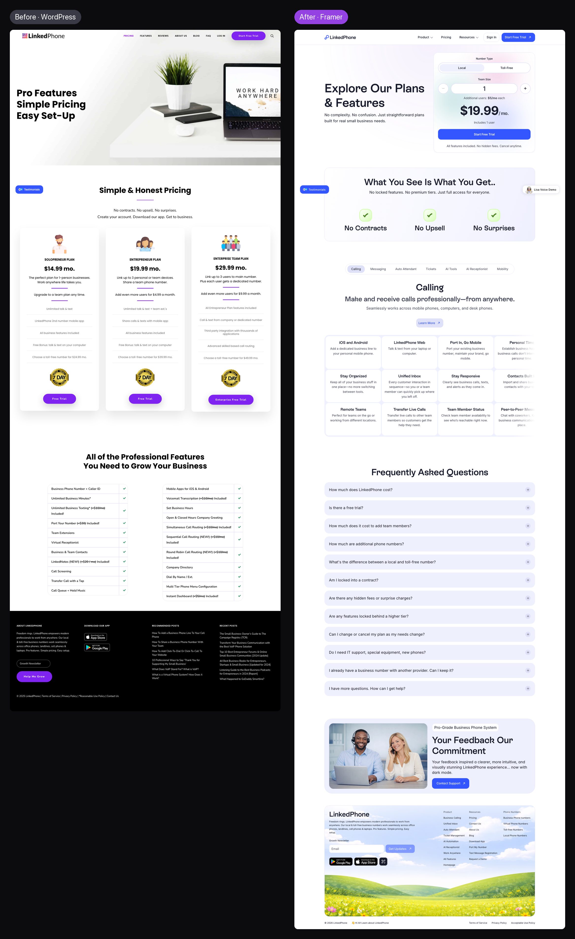
The old pricing page asked visitors to compare three plans and a checklist of struck-through add-ons before they understood the product. The new one leads with a calculator: local or toll-free, team size, one price. "No contracts. No upsell. No surprises." sits right under it, and the features follow as tabs by module.

Before → After · Pricing Left, the old pricing page with a laptop photo and the headline Pro Features Simple Pricing Easy Set-Up. Right, the new pricing page with a price calculator.
Both pricing pages. Open it to compare them at full length.

On a phone

Built for the screen most customers use.

LinkedPhone's customers run their businesses from their phones, so every section was designed at phone width, not just reflowed. The product previews are phones to begin with.

Before → After · At 390 pixels Four phone screens: the old homepage with a tiny laptop mockup, the new homepage with three phones of the real app, the old Virtual Receptionist page with floating icons, and the new Auto Attendant page.
Old home, new home, old call menus, new Auto Attendant, at 390 pixels wide.

Chapter 07

In Motion

Once the pages existed, every claim on them learned to act itself out.

Interaction & motion

Motion that demonstrates, not decorates.

I made the motion graphics in Jitter, one per preview. Each is a few seconds long and demonstrates exactly one sentence: a call reaches the right phone, a ticket gets an owner, a reply writes itself. The aim was memory, not decoration: someone should be able to describe what LinkedPhone does after closing the tab.

Calling: one line, on every device.
Tickets: from a message to a task.

Lisa, on every page

A live demo, one tap from any page.

LinkedPhone sells an AI receptionist, and no screenshot can tell a business owner what matters most: how she sounds to the people who call them. So the website lets them call her.

  • A preview of the product. The call runs in the browser over LinkedPhone's own calling system, so a visitor hears the real voice, audio quality and pace: what their customers would hear.
  • A guide who sells. This Lisa is set up as the LinkedPhone Assistant. Ask what Auto Attendant does, how pricing works or whether you can keep your number, and she answers.
  • Unintrusive, always reachable. A small pill, not a pop-up. Open it and it becomes a call card; minimise it and the call carries on as a timer while you read.

One model, set up once, working as both a product demo and a guide to the company, on every page of a 500-page website.

Pill, call, minimised: the whole interaction, from captures of the live site.

Chapter 08

Design Ships

The CMS that let design ship at scale, and what changed once it could.

The CMS

Content as data, design defined once.

Most of the website repeats. I worked out which content was genuinely unique and which was the same shape filled with different facts, and turned every repeating family into a CMS collection. I designed the templates and the collection structure; a junior designer on my team built the collections with me and moved the entries in. Old addresses were mapped to their new homes, so years of search traffic weren't thrown away.

  • 85Area codesOne template
  • 60States & provincesUS and Canada
  • 59CitiesAlbuquerque to Winnipeg
  • 116Blog postsNow under /blog/
  • & moreEverything elseHubs, modules, company and campaign pages
One template, 85 pages · Area code 213 The 213 Area Code page on the new site: a map of California with Los Angeles marked, and a structured introduction about the area code.
One entry of 85. Open it to scroll the whole template.

The blog

One system for every post.

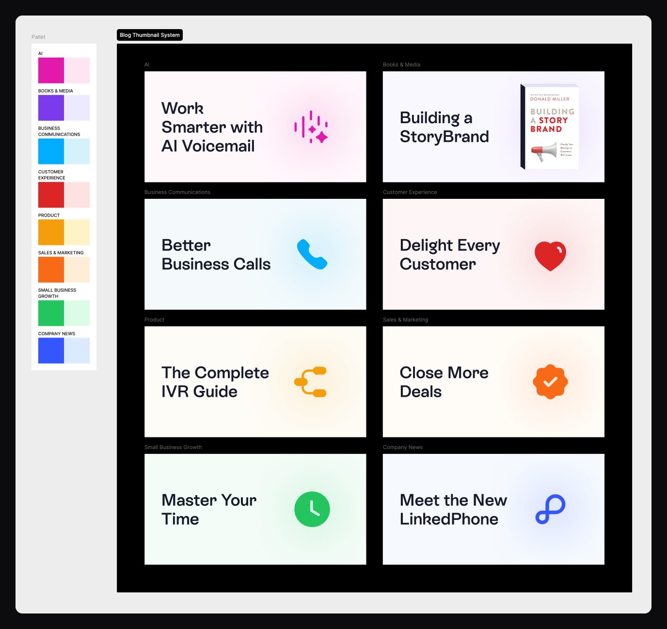
Every post's thumbnail comes from one template, with a colour for each of eight categories, from AI to Company News, so a reader knows what kind of post it is before reading the title. Next, the blog moves to an internal CMS with automatic anchoring, so long posts get their table of contents without anyone writing one.

Blog thumbnail system A blog thumbnail system: a palette of eight categories, each with a strong and a pale colour, and eight example thumbnails such as Work Smarter with AI Voicemail, Better Business Calls and Meet the New LinkedPhone.
One template, eight categories, a colour each.

Results

Sustained attention, and a team that ships.

The MVP page showed that people would read, and the live site has held that since launch: the average session is 3 minutes 58 seconds, and it has never fallen below 3 minutes 45 seconds. For a site people visit to evaluate a phone system, that's a lot of attention.

3m 58s

Average session sitewide since launch, never below 3m 45s.

98%

Less engineering dependency: new pages and changes ship from design.

500+

Pages redesigned, rebuilt and restructured onto the new system.

Once the website could change as fast as the product, it started carrying the product in public. When Lisa shipped, she had a module page, a place in the menu, and a voice demo on every page. When Auto Attendant was rebuilt, its page showed the new setup rather than a drawing of a receptionist.

Lesson 01

A website is a communication platform.

Not a marketing asset apart from the product. It should change when the product changes, on the same day.

Lesson 02

Every handoff creates friction.

The fastest workflow is the one with the fewest translations.

Lesson 03

Write the rules before the pages.

A structure and a schema made 500 pages feel like one site.

Lesson 04

Context before features.

Visitors read a feature when it answers a problem they already recognise.

Closing

This was never really about Framer. It was about closing the distance between thinking and making. Before it, design made websites. After it, design built them.