Pravar
Contact Download CV
Case Study 01·2023–2024·Systems Design & Information Architecture

Auto Attendant

Organizing complexity. How LinkedPhone turned one of its most powerful features from an intimidating configuration tool into a system small businesses could actually understand.

Scroll to begin

Act 01Context

For some businesses, Auto Attendant was the reason they chose LinkedPhone in the first place.

It let a small business behave like a much larger organization. Calls could be routed. Messages could be played. Voicemails could be collected. Teams could receive calls based on conditions. Customers could be guided toward the right destination.

In theory, it was one of the most powerful capabilities in the product. In reality, most customers barely scratched the surface.

The feature was valuable.

The feature was sticky.

The feature was powerful.

But it was also intimidating.

And that contradiction became the beginning of the redesign.

Chapter theme

The challenge was never building a powerful routing system. It was helping people feel confident enough to use it.

"We thought users needed more configuration. What they actually needed was more confidence."

Executive Summary

Loved. Powerful. Underused.

Challenge

Auto Attendant was one of LinkedPhone's strongest differentiators, yet only a small share of customers ever explored its full capability. Most stopped at basic setup. Advanced configuration went unused.

Breakthrough

We first approached it as a configuration challenge. Eventually we understood it was a confidence challenge. The answer wasn't exposing more power. It was revealing complexity gradually.

Outcome

A single modular architecture where basic and advanced setups became the same system. Users could start simple and scale their configuration as their needs, and their confidence, grew.

Transformation at a glance

ProblemA powerful feature people were afraid to touch
InsightThe barrier was confidence, not capability
SystemProgressive disclosure over one shared architecture
ImpactDeeper engagement, richer configurations, a model for complexity everywhere
Timeline
~12 moRedesign era
Platforms
MobileiOS · Android · Web
Teams
DesignProduct · Founders
Discipline
IASystems · Progressive disclosure
Legacy
PlatformPrecursor to Lisa

Where We Were

A feature that wasn't failing, but wasn't reaching its potential.

Before the redesign, Auto Attendant already existed. Customers used it. Some had specifically purchased LinkedPhone because of it. It was one of the product's strongest differentiators.

However, adoption patterns revealed something interesting. Only a relatively small percentage of users created anything beyond basic routing. Most configurations stayed extremely simple. Many businesses never explored the more advanced possibilities available to them.

The feature suffered from an unusual problem.

It wasn't failing.

But it wasn't reaching its potential either.

Three versions existed at once

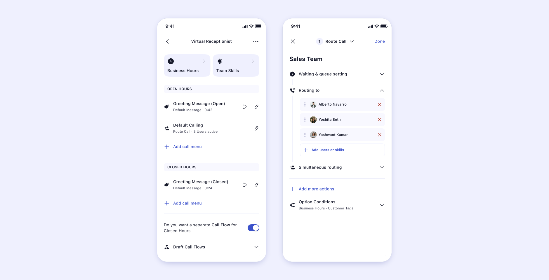
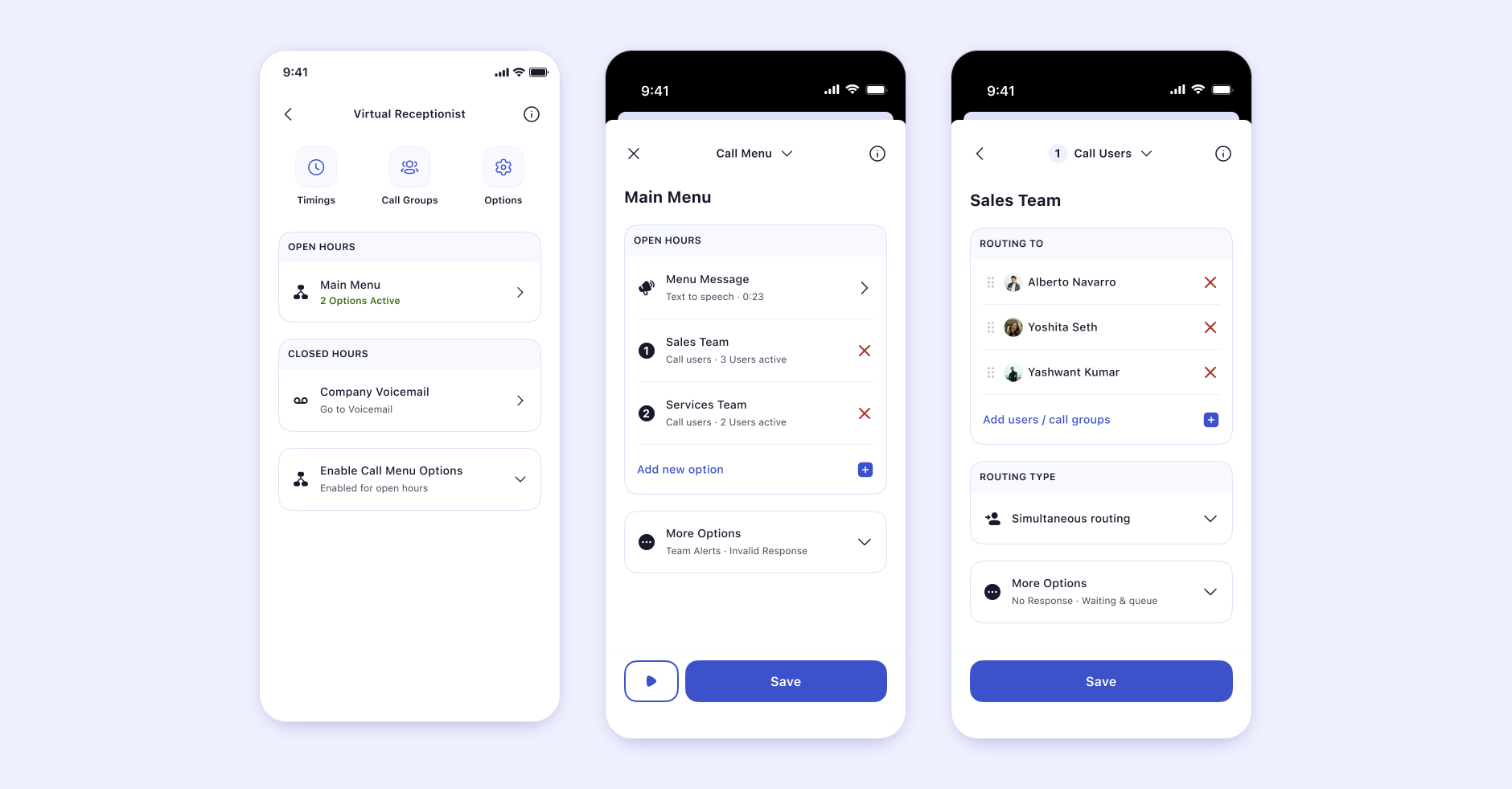
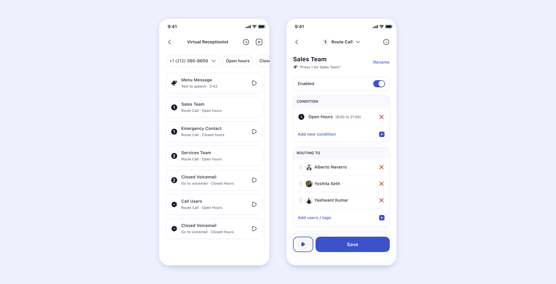
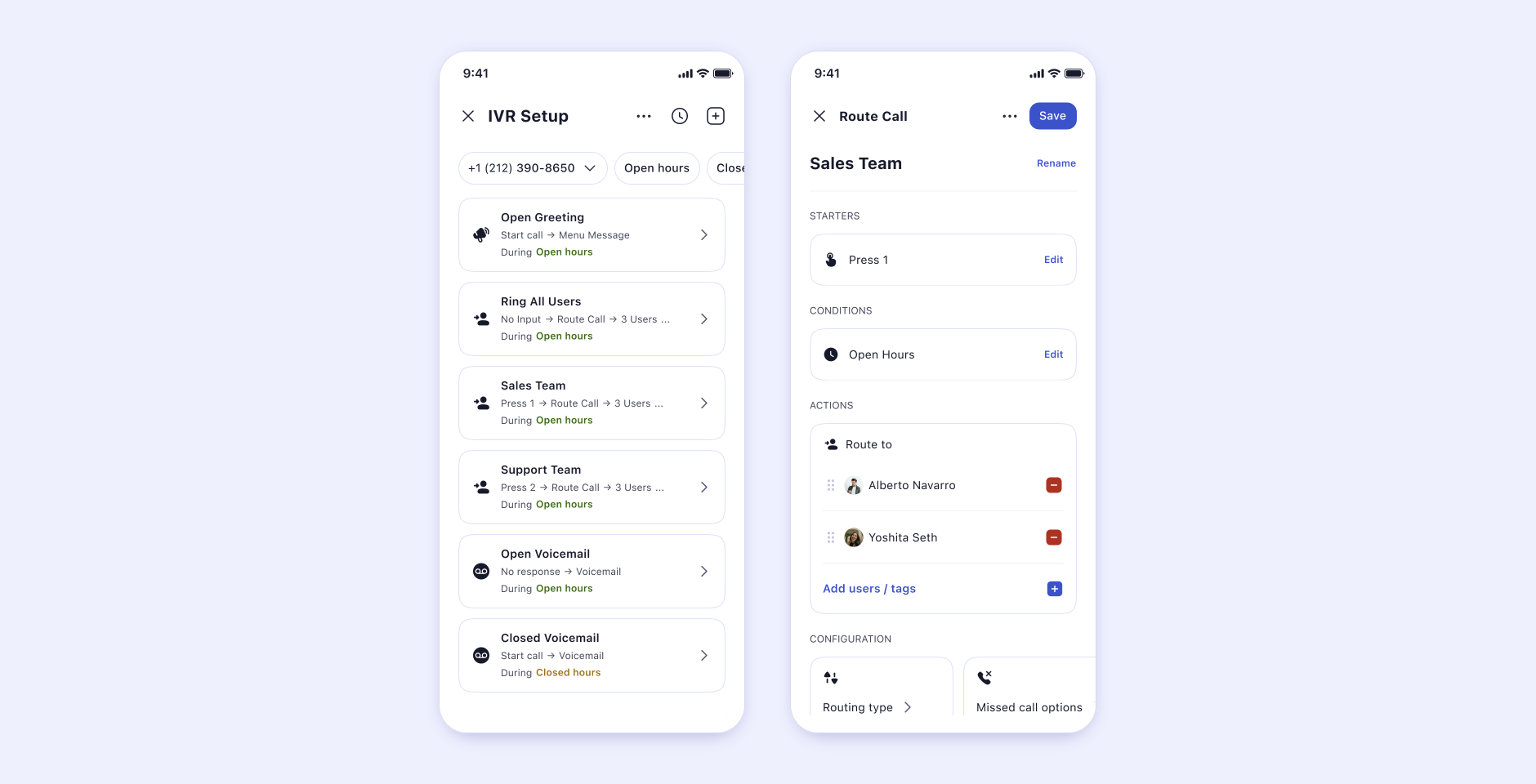
The Live ProductThe version customers were actively using every day.
The Ongoing RedesignA work in progress that mostly improved the visuals.
The Future DirectionThe version that eventually emerged from this work.
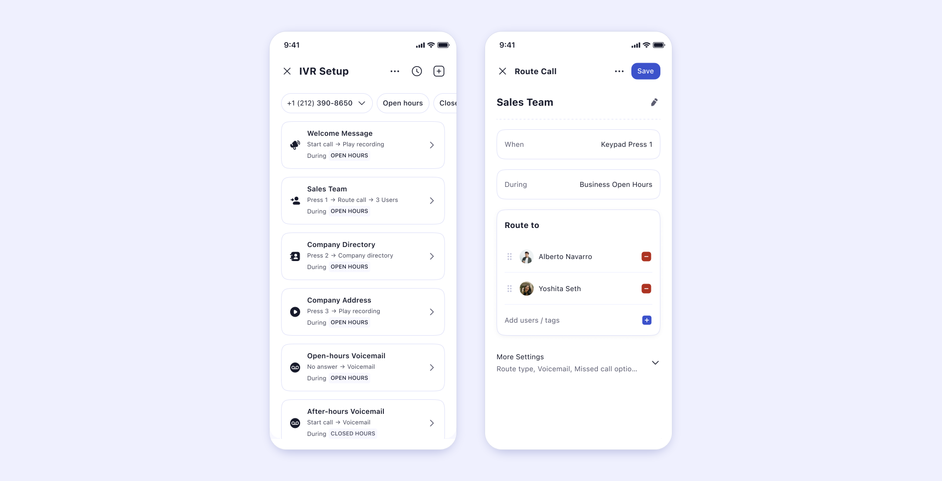
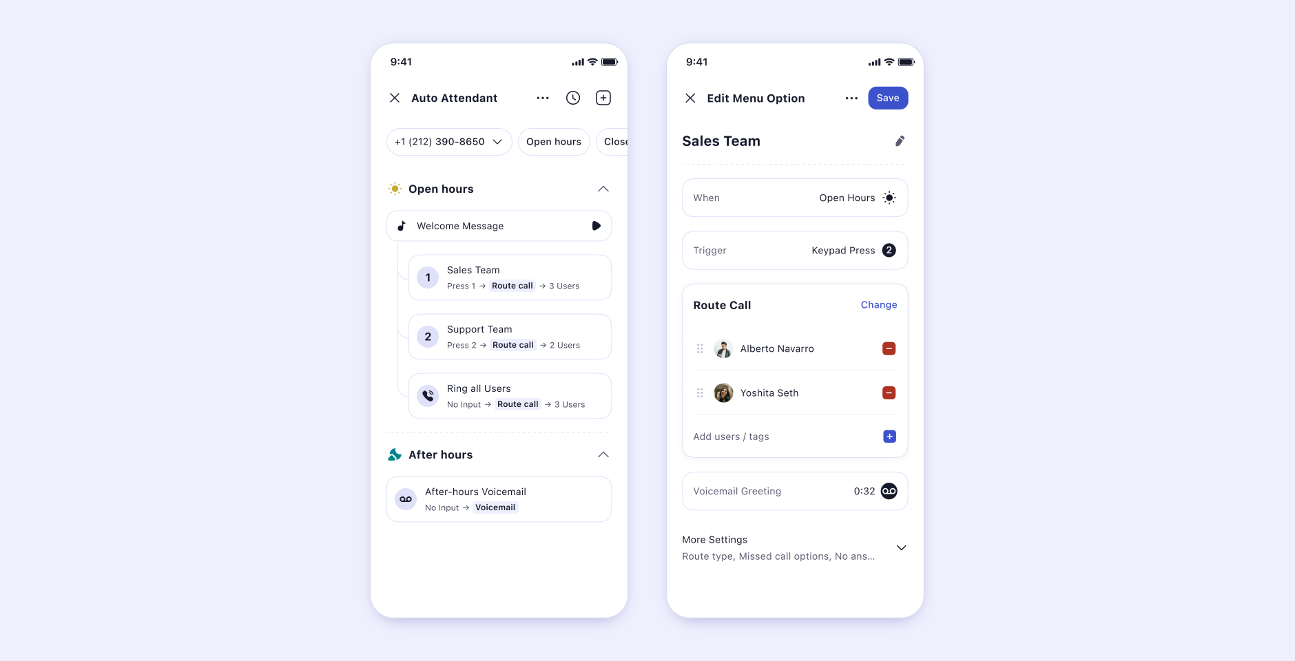
Artifact · The live experience, annotated

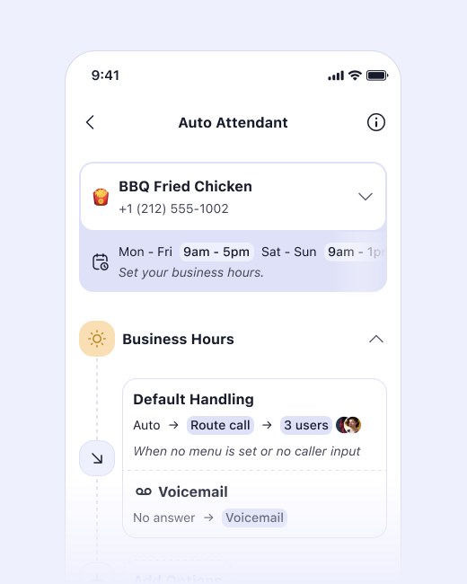
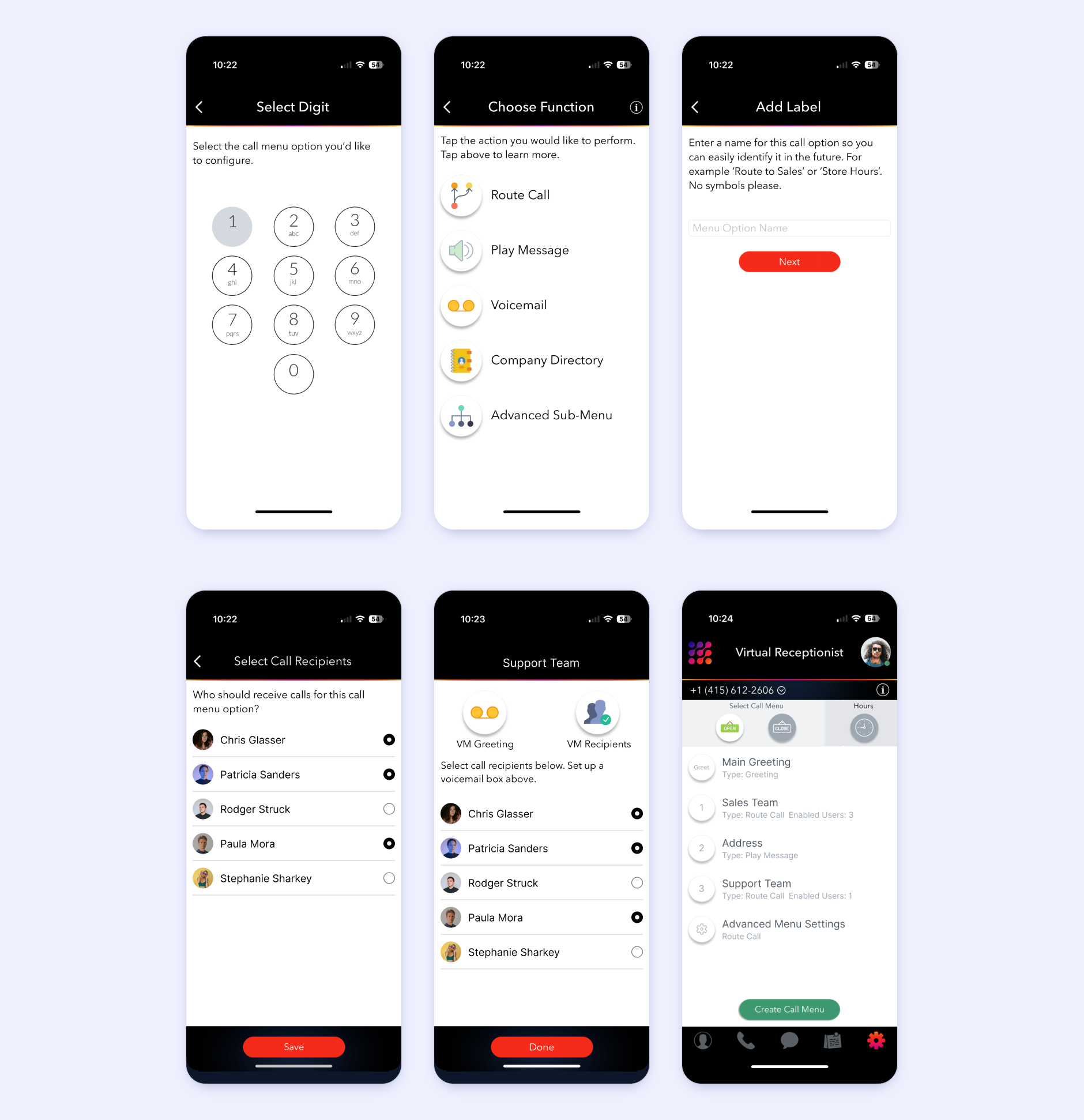
The live product, before

Every decision point highlighted, every friction point called out, every confusing interaction marked.

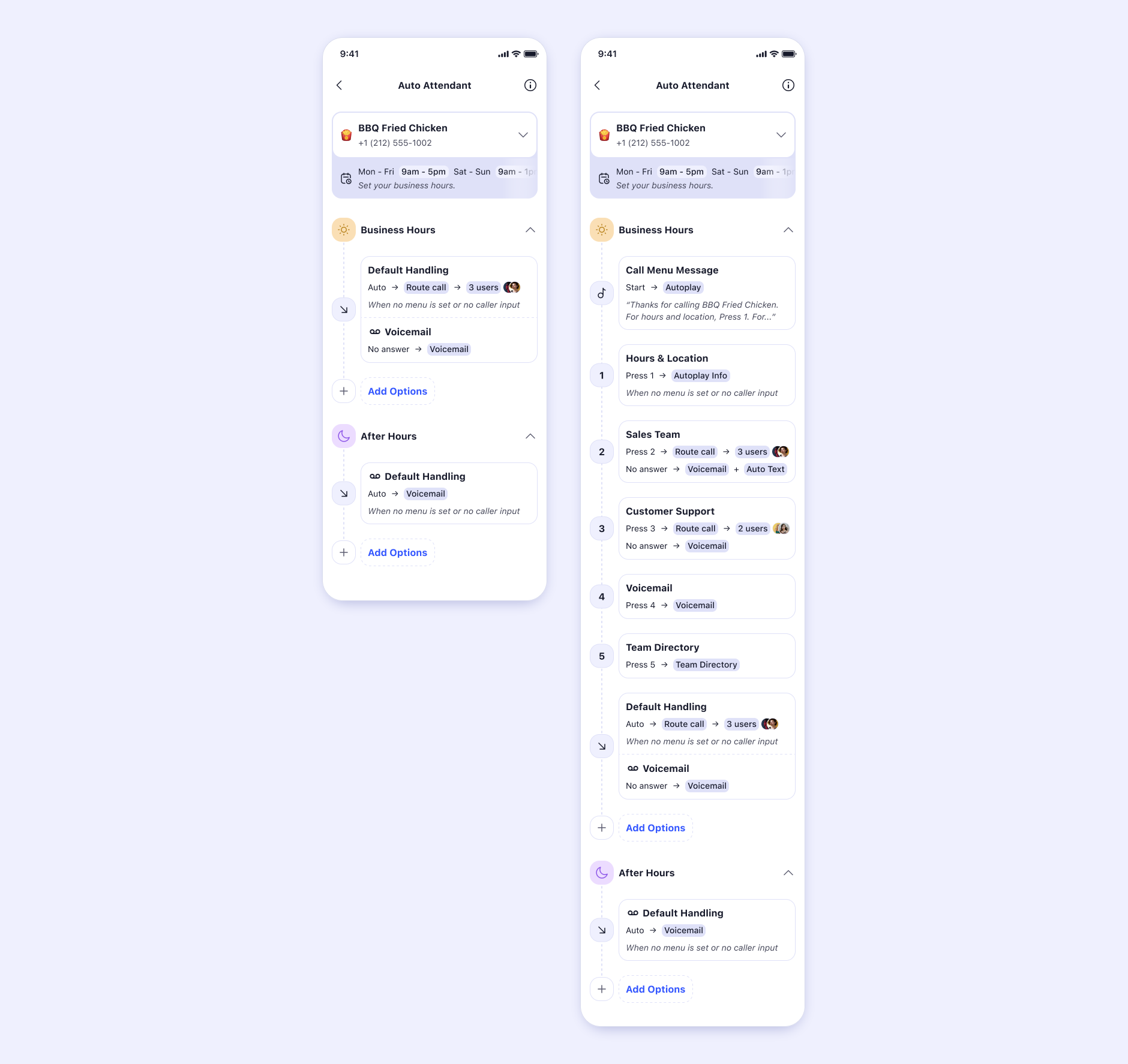
The three states of Auto Attendant, side by side. The challenge wasn't simply improving UI. It was understanding why people stopped.

Act 02Problem

The Problem

A hidden contradiction lived inside the feature.

On one hand, business owners wanted flexibility.

On the other, business owners wanted simplicity.

Most solutions on the market solved one side. Very few solved both. Enterprise tools generally looked like node builders, flow editors, complex diagrams, technical workflows: large canvases with many states, many decisions, many possibilities.

While powerful, these solutions assumed users already understood how call-routing systems worked. Most LinkedPhone customers didn't. They weren't trying to design call systems. They were trying to answer customers.

Artifact · Annotated audit

Existing setup, annotated

Every decision point highlighted, every friction point called out, every confusing interaction marked.

Customer impact

Users became overwhelmed. Most configurations never progressed beyond basic setup. Advanced functionality stayed hidden behind complexity.

Business impact

One of LinkedPhone's strongest differentiators was underutilized. Customers received only a fraction of the value available to them.

Internal impact

Future feature expansion would only get harder if the underlying architecture stayed difficult to understand.

Investigation

We explored the obvious answer, extensively, and watched it break.

The first instinct was to look at the market. Competitors primarily used node builders, flow editors, workflow diagrams, visual routing systems. At first glance these seemed promising: they represented logic visually, exposed relationships, provided flexibility.

So we explored them. Multiple concepts were built around node-based systems, flow builders, branching architectures, visual routing maps.

Initially they looked impressive.

During design reviews they felt powerful.

During testing they started breaking.

As users interacted with them, a pattern emerged. People spent more time understanding the interface than configuring their business. The software was teaching itself, not helping users achieve outcomes. That observation became critical.

Research question

What if users shouldn't need to understand routing systems at all?

Artifact · Research board

Investigation wall

Competitors, mental models, user observations, node-builder explorations, testing notes.

Insights

What we heard, once we stopped assuming.

Artifact · Research clusters

Notes, sorted into four themes

Every quote and observation clustered until the same four patterns kept surfacing.

Insight 01

Users wanted outcomes, not systems.

Observation
Users spoke about goals. Never architecture.
Meaning
People wanted calls routed correctly, not routing diagrams.
Implication
The interface should focus on outcomes.

Insight 02

Users rarely start advanced.

Observation
Most businesses begin with simple requirements.
Meaning
Advanced functionality should not dominate the experience.
Implication
Progressive disclosure becomes essential.

Insight 03

Confidence drives exploration.

Observation
Users expanded setups only after successfully completing simpler ones.
Meaning
Mastery creates curiosity.
Implication
Simple success should unlock complexity.

Insight 04

Power isn't the enemy. Exposure is.

Observation
Users weren't rejecting advanced features. They were rejecting advanced complexity upfront.
Meaning
The same capability could exist. It just needed to appear differently.
Implication
Change the exposure, not the power.

Act 03 · Turning Point

We thought users needed more configuration.

They needed more confidence.

This became the turning point. The goal shifted: from building a more powerful interface to helping people progressively understand complexity. Everything changed after this realization.

Exploration Lab

Dozens of directions. Only one held.

Every direction taught us something, including the ones that failed. Especially the ones that failed. Each was scored against the same two questions: was it simple, and was it still powerful?

Direction A

Node Builder

Failed
Why it looked promising
  • Industry standard
  • Powerful
  • Flexible
Why it failed
  • Too intimidating
  • High cognitive load
  • Mobile amplified the complexity
Simplicity
Power

Direction B

Wizard-Based Setup

Partial
Why it looked promising
  • Simple
  • Guided
  • Easy to start
Why it fell short
  • Rigid
  • Hard to revisit
  • Poor scalability
Simplicity
Power

Direction C · The winner

Progressive Disclosure System

Succeeded
Why it looked promising
  • Simple for beginners
  • Powerful for experts
  • Expandable, modular
Why it succeeded
  • Complexity could scale with user confidence
  • This became the foundation
Simplicity
Power

The percentages above are illustrative evaluation scores from the exploration process, not measured data.

Evolution tree

Node BuilderPowerful, but people frozeFailed
WizardEasy to start, hard to live inPartial
Accordion / Progressive SystemSimple surface, deep capability underneathFinal direction

Breakthrough

The breakthrough wasn't visual. It was structural.

Instead of building separate systems for basic and advanced setup, we merged both into a single architecture. Users would only ever see what they needed right now. Complexity stayed available, but hidden until necessary.

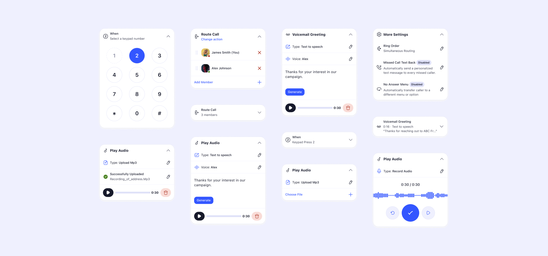
The interface started behaving like Lego blocks. Simple blocks. Composable blocks. Expandable blocks. Reusable blocks. Users could build complexity without ever feeling overwhelmed.

One architecture, four depths

SimpleOne trigger, one action
ExpandableAdd a condition
AdvancedMultiple branches
Fully CustomizedNested logic

The same building blocks, revealed one layer at a time. Depth is a choice the user makes, never a wall they hit.

Concept · The Lego-block interface

Composable, not configured

Small blocks that snap together instead of one dense settings panel.

Complexity didn't disappear. It just stopped arriving all at once.

Act 04System

System Architecture

A grammar simple enough to start, deep enough to never outgrow.

The final architecture revolved around a single, legible grammar.

TriggerWhen this happens…
Condition…and this is true…
Action…do this.

Basic users

One trigger, one action.

Nothing else on screen. It just works.

Advanced users

Multiple conditions, multiple actions, nested logic.

The same grammar, more deeply composed.

The point

Same system. Different depth.

No one is ever moved to a "pro mode." They grow inside the one they already know.

Design principles

01

Reveal complexity gradually

02

Maintain confidence at every step

03

Keep outcomes visible

04

Encourage exploration, preserve power

Design System Impact

If the system could handle Auto Attendant, it could handle almost anything.

Auto Attendant reinforced a whole family of design-system patterns, and became one of the strongest stress tests of the emerging system.

Auto Attendant List structures Progressive disclosure Cards Accordion behaviors Contextual actions State management

Every pattern Auto Attendant produced, and how they connect back to the product. Six patterns, one product, one shared grammar.

List structures

Pattern

Progressive disclosure

Pattern

Cards

Component

Accordion behaviors

Interaction

Contextual actions

Pattern

State management

System

Product Showcase

The system, made visible.

Each screen exists to answer three questions: what problem it solves, why it exists, and how it works. The reasoning matters more than the aesthetics.

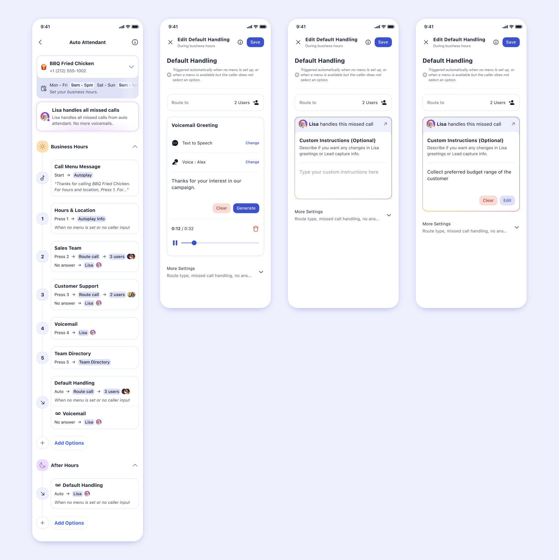
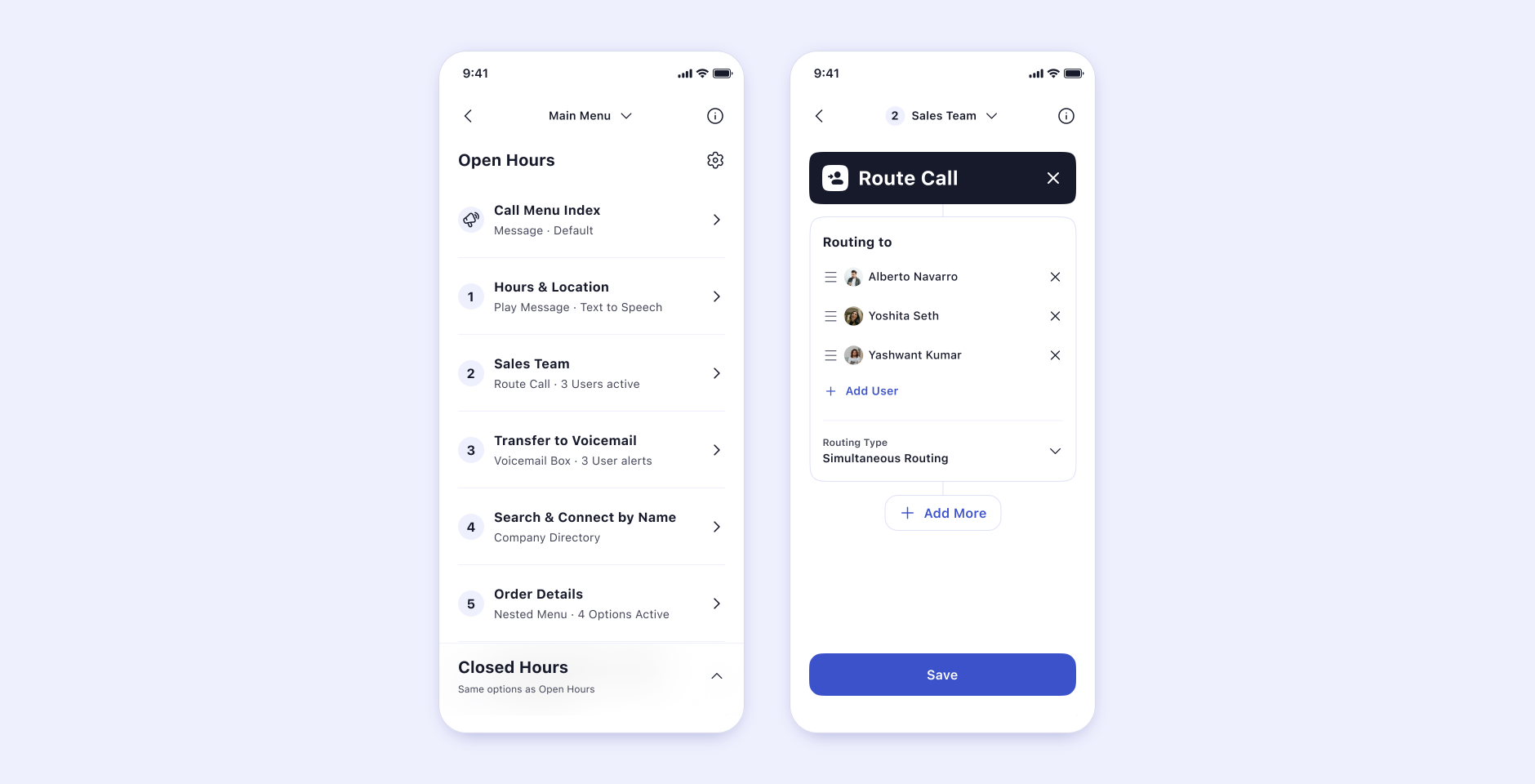
Screen · Overview

The routing overview

A calm home for every rule a business has built, legible at a glance regardless of how deep it goes.

Problem. Users lost track of what their system actually did. Why. Orientation has to come before configuration. How. One scannable list, depth on demand.

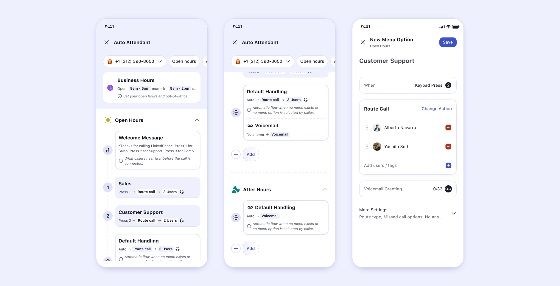
Screen · Basic setup

Basic setup flow

One trigger, one action, and a business that's answering calls in under a minute.

Problem. First-run intimidation stopped adoption. Why. Early success is what unlocks everything after it. How. The simplest possible expression of the shared grammar.

Screen · Advanced setup

Advanced configuration

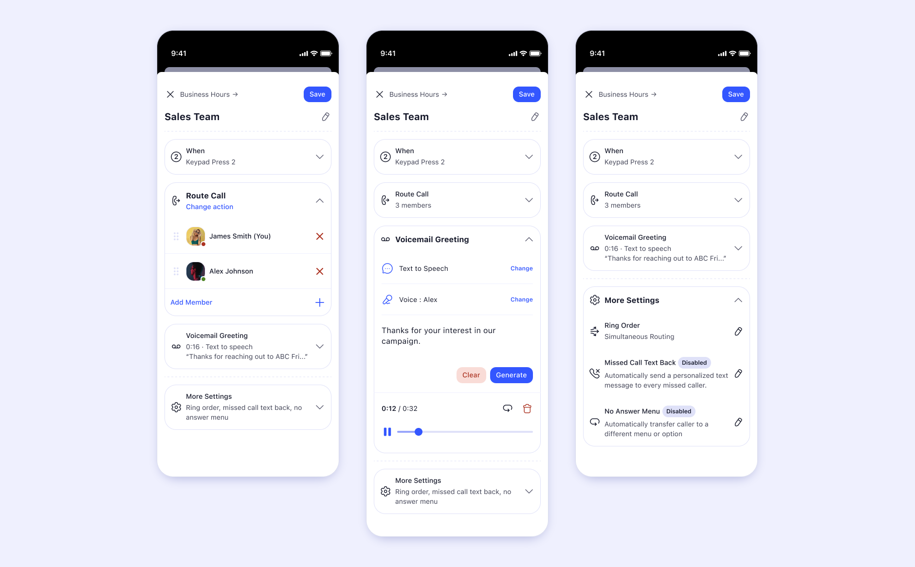
The same interface, deeper. Conditions and branches appear as the user reaches for them, never before.

Problem. Power users previously needed a different tool. Why. Growth should never mean starting over. How. Progressive disclosure inside the same object.

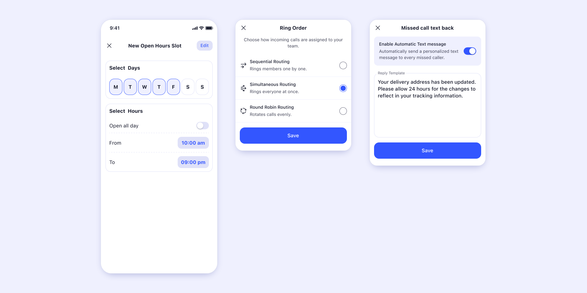
Every other state, at a glance

Modular expansion

Add a block

Composable expansion.

Edge cases

Fallbacks & errors

What happens when no rule matches.

Interaction & Motion

Motion did the explaining, not documentation.

Auto Attendant leaned heavily on interaction design. The motion wasn't decoration. It was how the system explained itself.

Accordion expansion

Reveal in place

Context preservation

Never lose your place

Progressive disclosure

Depth on demand

Hierarchy transitions

Level in / out

Expandable logic

Branch as needed

State feedback

Always legible

Video · Storyboard

Accordion motion study

When a section opens, the surrounding context stays visible and stable. Confidence, encoded in motion.

Act 05Impact

Validation

The same direction, reinforced from every angle.

Testing happened continuously: internal reviews, user testing, founder feedback, customer feedback, even friend testing. Patterns consistently pointed the same way.

Simple first.

Advanced later.

Feature engagement increasedMore users returned to Auto Attendant after their first setup instead of abandoning it.
Configurations became richerRules built after the redesign used more conditions and branches than before it.
Exploration became more commonUsers started opening advanced options on their own, without being prompted or onboarded into them.

Directional results shown; specific figures live in the private appendix.

Ripple Effects

The idea outgrew the feature.

The concept of progressive disclosure escaped Auto Attendant and reshaped how LinkedPhone thought about complexity itself.

Auto Attendant Design System Information Arch. Desktop workspace Unified Work → Lisa

Auto Attendant to Design System to Information Architecture to Desktop to Unified Work Model to Lisa. Most importantly, it changed how the company thought about powerful software.

Archive

The evidence vault.

Available, but never required. Everything that produced the thinking above.

Original deck

Embed

Exploration boards

Figma

Research notes

Doc

Testing outputs

Video

Competitor analysis

Board

Flow maps

Diagram

Lessons

What we believed. What we learned.

Lesson 01

Complexity isn't the enemy.

Hidden complexity isn't the solution either. The real challenge is revealing complexity at the right moment.

Lesson 02

People don't learn systems. They learn confidence.

Master the emotion and the mechanics follow.

Lesson 03

The most powerful feature isn't the most valuable.

The most understandable feature is.

Lesson 04

Progressive disclosure scales better than simplification.

You don't have to remove power to remove fear.

Legacy

It started as a routing tool. It became a philosophy.

The project fundamentally changed how we approached complexity across LinkedPhone. The lessons learned here later reappeared in Desktop, the Work Model, 10DLC, Website, and Lisa.

The feature itself became more usable. But the larger impact was changing how the entire organization thought about powerful software.

Closing

Power is easy. Clarity is hard. The goal was never to make Auto Attendant more capable. It was to make capability feel approachable.