Act 01The Contract
LinkedPhone serves more than 50,000 small businesses where the owner is also the receptionist, the salesperson and the technician. When they can't pick up, the business stops. Lisa answers instead.
The design problem was never the AI. It was making someone willing to hand over their phone.
Chapter theme
An intelligence nobody asked for, made into a teammate somebody would hire.
The thesis, in four headers
Vox. Vox AI. Lisa. Lisa Answers All Incoming Calls.

The interface started by naming the system, moved to naming the behaviour, and ended by naming a person doing a job. Everything below is the evidence for this strip.
Scope
Design owned the product. Engineering owned the model.
I led design end to end: voice-AI research alongside engineering, the prompt and onboarding flow, the information architecture, interaction and interface design across the product, more than 25 tested states, Lisa's character and illustration system, the marketing films, and the product page that sells her.
Engineering owned model selection, orchestration, telephony and infrastructure. That line is worth stating plainly, because the interesting decisions in this project sit exactly on it.
Working alongside the founders was the daily reality of this project rather than a reporting line. They held the vision, engineering held the technology, and my job was the translation between them: turning intent into something that could be built, and constraints into something that could be shown. The three-way conversation is where most of the decisions in this case study actually got made.
One surface is shown here. Lisa ships on three.
She runs on web and tablet as well as mobile, and the interfaces are near-identical, because the design system was already carrying that weight: the layouts adapted without a redesign. This case study stays on one surface for that reason. Three near-identical sets of screens would add length without adding argument, and the fact that it didn't need three designs is the more interesting point.
First working prototype to shipped product
Tested interface states across six eras
Caller stops speaking to Lisa starts, down from 8–10s
Character assets, states and animations
- Timeline
- 2025–26Shipped
- Availability
- All plansNo premium tier
- Category
- NewAI receptionist
- Discipline
- AI ProductHuman-centered
- Legacy
- SupersetOf Auto Attendant
Act 02The Chain
Where We Were
Lisa wasn't an idea. She was the end of a sequence.
Before Lisa, we put AI where it was safest: after the call was over.
Call intelligence came first, and I owned it from the design and product side. When a call ended you got a summary, the key points, follow-up actions, sentiment, contact suggestions, lead capture and a breadcrumb trail of the conversation. Adoption was strong, and it taught us the thing we'd need later: people accept AI most readily when it hands them back their own information rather than acting on their behalf.
Then we moved one step closer to the conversation. Alongside one-tap and templated replies, we shipped AI reply suggestions, drawn from your history with that customer, for the moments you don't know what to say.
Summaries were retrospective.
Suggestions were advisory.
The next step changed the risk profile entirely.
What if AI didn't summarise the call or suggest a reply, but answered the phone?
Each step brought AI nearer to the live conversation without ever entering it. The last one enters it.

Call intelligence as it stood before any of this. A colleague answered, or nobody did and it became a voicemail summary; either way the AI arrived afterwards with the summary, the sentiment and the follow-up actions. Every step so far handed information back to the owner. The next one would speak on the business's behalf.
Act 03Making It Real
The Bake-off
On a phone call, late is worse than wrong.
We wanted to build the voice layer in house: speech recognition, language model, speech synthesis, all chosen by us and then made fast enough to hold a phone call. I worked alongside engineering through the comparison, prototyping the architecture, running models against each other, and listening to what came out.
The trade-off was three-way, not two-way. Latency against accuracy against intelligence. A small model answered quickly and shallowly. A larger one reasoned well and arrived late.
A caller reads a pause as nobody being there.
The number that mattered was the gap between the end of the caller's sentence and the start of Lisa's. We began at eight to ten seconds. I argued the ceiling had to be three to four, measured from the caller's side rather than the system's, because that is roughly how long a person waits before assuming the line is dead.
It is under a second now. Engineering owned this layer; I was in the room as a design partner, helping run tests, listening to output, and holding the latency budget to a human threshold rather than a technical one.
A design constraint expressed as a number engineering could hold itself to. Measured at the caller's ear, not at the server.
The Turn
The risk was never that she'd fail to convince anyone.
Five to six weeks in, the stack was hosted on a live phone number and I could call it.
What surprised me wasn't the quality. The intelligence was thin and the latency was bad. What surprised me was that none of that mattered. I was talking to a phone number, something was answering, and the illusion held anyway.
If a thin, slow prototype already felt like a person, the risk was that she'd convince them too easily.
Every guardrail in this project traces back to that call.
Guardrails
What Lisa is not allowed to do.
The prototype that felt like a person before it was any good set the agenda for everything after it. If the illusion is that easy to create, the design job isn't making her more convincing.
It is deciding where she has to stop.
Guardrail 01
She only knows what you taught her.
Lisa answers from the business's own knowledge and personalization, and from nothing else. This isn't a setting the owner can loosen; it's the only mode she has. A general-purpose model that will improvise an answer about your refund policy is worse than useless to a small business. It's a liability with your name on it.
Guardrail 02
When she's unsure, she takes a message instead of guessing.
Lead capture is the default fallback for a reason. Faced with a question she can't answer from what she knows, Lisa doesn't reach for a plausible sentence. She collects the caller's details and closes the loop with a human. The floor of every call is a real message to a real person.
Guardrail 03
She says she's an AI.
Asked directly, she answers directly. There is no version of this product where the illusion is worth protecting.
Guardrail 04
Asking for a human is a command, not a complaint.
If a caller asks to speak to a person, Lisa doesn't attempt to satisfy them first. She initiates the transfer.
Guardrail 05
Frustration escalates. It doesn't get managed.
If a caller is angry, abusive, or simply won't accept her answer, the response is the same: escalate to a person. If no one is available to take the transfer, she captures the lead and ends the call cleanly. She never argues, and she is never rude back.
Guardrail 06
Some fields are locked open.
Name and reason for calling can't be switched off. A business can decide what else Lisa asks for, but not whether a call produces anything at all.
Guardrail 07
Some fields she's told not to ask for.
Avoid collecting email addresses or phone numbers, as they're often misheard. Voice is a lossy channel, and a wrong email is worse than no email: it looks like a lead and it isn't one.
Guardrail 08
Nothing enters her knowledge unseen.
Everything she reads gets verified and shown back before it becomes something she'll say to a customer.
Every guardrail turns an unknown into a handoff. She never fills a gap with something invented. She fills it with a person, or with a message to one.
Three Blocks
The model wasn't the hard part. The structure of what it knew was.
Working through the prompt flow with engineering, the same three questions kept ordering themselves the same way.
What does she know?
The business's own information. Not authored, gathered: a website, a Google Places profile, images, documents, and whatever the owner tells us directly.
What can she do?
The jobs she performs. We started deliberately small: answer questions, capture a lead.
What can she set in motion?
The actions that leave the conversation. Route the call, take a message, hand off to a person.
That ordering isn't a taxonomy I imposed. It describes how the agent actually works: retrieve, then respond, then act. So I built the product's information architecture on the same three blocks. The thing a user configures is the agent's mind, and any structure that didn't match it would be a translation layer both sides had to maintain forever.
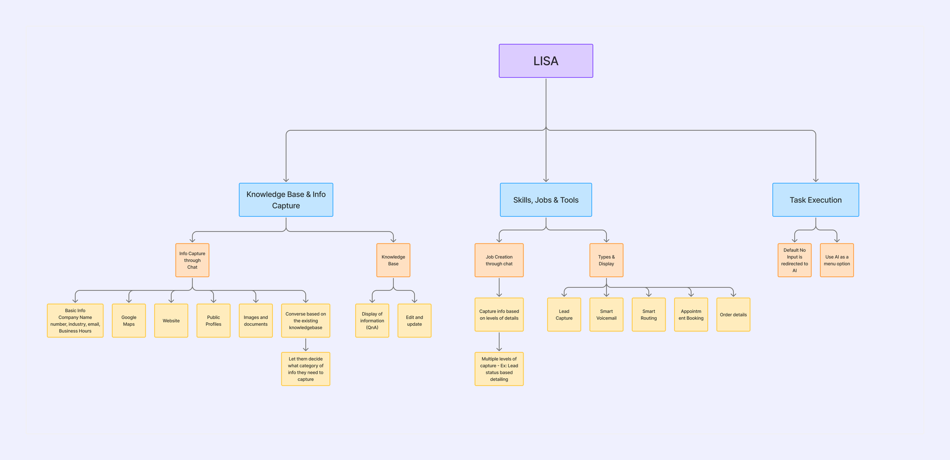
Knowledge, skills, execution. Building the interface on any other structure would have meant maintaining a translation layer forever. The two entries under Task Execution date the thinking exactly: default no input is redirected to AI, and use AI as a menu option. At this stage Lisa lived inside Auto Attendant. She was what happened when the menu ran out, and Act 05 is the story of that relationship turning over.
Onboarding
She doesn't ask you to fill in a knowledge base. She asks for a link.
Onboarding was the first thing I designed in full, and it solves the problem every competitor solves badly: the business already has the answers, and asking them to type it all in again is why nobody finishes setup.
The flow underneath is not simple, and it is where design and prompt engineering stop being separable.
Mechanism 01
Verification before ingestion.
- What it does
- Lisa takes a website, a Google Places profile, images or documents, checks the link resolves, pulls what she found, and shows it back. Nothing is absorbed silently.
- Why
- The failure mode for an AI receptionist isn't refusing to answer. It's confidently telling a customer the wrong hours.
- Cost
- One screen, in exchange for making the user the last checkpoint. The cheapest insurance available.
Mechanism 02
A budget on the user's patience.
- What it does
- Where the gathered material isn't enough, Lisa asks. Question rounds are bounded at ten to twelve.
- Why
- Setup that runs indefinitely is setup nobody finishes.
- Cost
- Some knowledge bases start thinner than they could. They fill in later, from real calls.
Mechanism 03
Waiting handled as an experience.
- What it does
- The flow branches on whether the site will take longer than about fifteen seconds to read. If it will, the conversation continues while reading happens in the background.
- Why
- Nobody watches a progress bar.
- Cost
- Two paths through the same flow instead of one.
Mechanism 04
A completeness threshold the user never sees.
- What it does
- After ingestion the knowledge base is scored for coverage. Above the threshold, setup completes. Below it, Lisa runs another round of questions and re-checks.
- Why
- A number telling a business owner their AI is 74% ready does nothing except make them anxious about the other 26%, and the anxious response is to switch her off rather than teach her more.
- Result
- The score drives Lisa's behaviour instead of the user's. She asks a few more questions. The user experiences that as thoroughness.
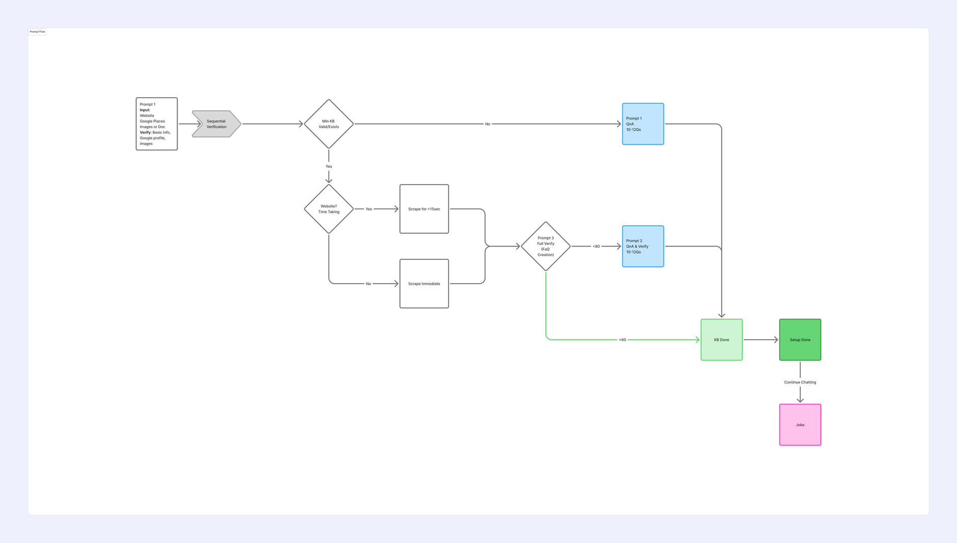
Verification, a scrape-timing branch, a bounded question round, and the completeness threshold that decides whether setup is finished: below eighty it loops back for another round of questions, above eighty the knowledge base is done. The score is real and load-bearing. It just never reaches the interface, which makes it a decision about anxiety rather than about accuracy.
Research, running alongside
What we learned while building, not before.
The research didn't come before the build. It ran next to it, which is how it works on a shipping team, and I'd rather say so than tidy the sequence afterwards.
Testing ran continuously, from the first prototype to the current build, rather than as a phase. Through design it was near-instantaneous: A/B tests on variants, guerrilla sessions, think-aloud studies, anonymised task studies, and usability and accessibility passes, with small businesses in India and the US. From beta onward it ran against real shipped builds and real calls, across three months and three widening rounds.
Raw notes, clustered into four themes
Tags, quiet field notes and quotes gathered from small business owners across the build, grouped once the same four patterns kept surfacing.
Act 04The Search
By the end of Act 03 I had a working agent on a real number, a structure for what it knew, and a conversation that could build it. I had no idea what it should look like.
The next months were spent finding out. Most of what I tried was wrong, and the wrong versions are the ones worth showing.
Watch the names as the eras pass. Vox, then Vox AI, then Vox Assist, then Anna, then Lisa. And in parallel the card titles: Missed call handling is active, then Handle Missed Calls, then Lisa Answers All Missed Calls.
Era 1 · Configuration
Building the interface directly on the architecture.
Settings, dashboard, configuration. The first working UI existed so we could reach the feature at all: even internal testing needed a way to build the knowledge base.

Left: Response Quality 86/100. Caller Satisfaction 48/100. Quality verdicts on your AI, scored out of a hundred, on the home screen. By the next version they were gone. Right: the same product configured from inside an Auto Attendant menu option, occupying the Voicemail slot. At this point the AI is what happens when the menu fails. Hold this screen; it returns as the last figure in this case study.
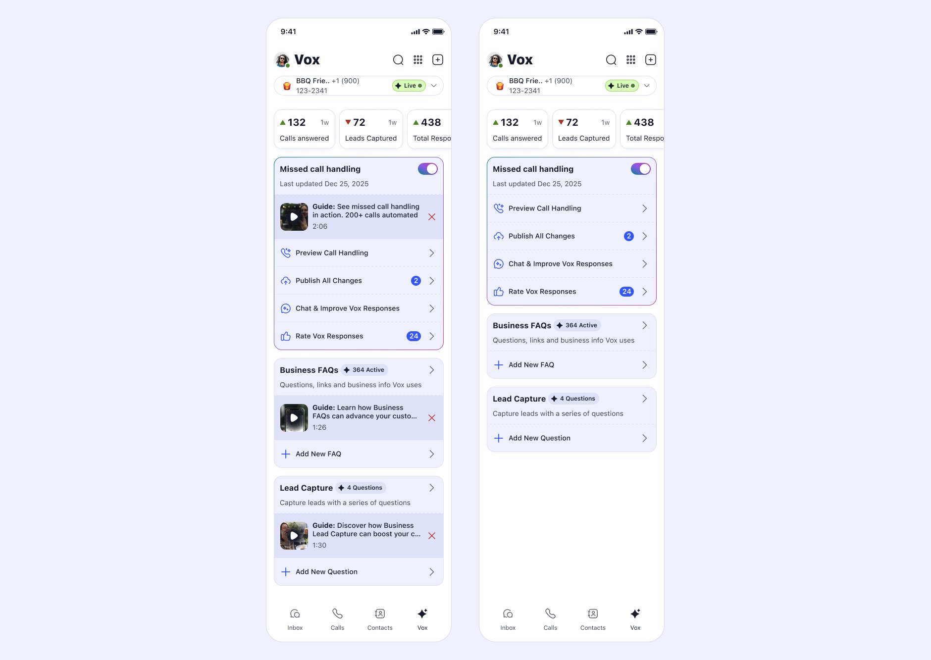
Verdicts became counts: calls answered, leads captured, total responses. And a density study, the same screen with an explainer video inside every card and then with them all removed. Teaching material inside the interface competes with the interface.
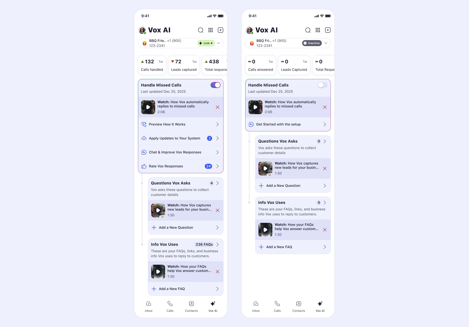
Handle Missed Calls. Questions Vox Asks. Info Vox Uses. The first version where the labels describe what happens rather than what the system is called, and the first empty state, which is where a user actually meets the product.
The structure held. The surface looked like every other voice-agent builder.
For a restaurateur, a barber or a contractor, those tools are unusable.
Era 2 · Presence without a person
If it can't look like someone, make it feel like something is there.

An iridescent form, reactive to voice and to the device's own motion. The most technically involved interface work in the project, and a dead end, but not for the reason we expected.

Halftone fields, then dot-ring forms, then back to the orb. Seven states asking the same question: what does an intelligence look like when it has no face?

The dot-ring settled in, with a persistent Get Started running through every empty state. The visual language was resolved. The problem underneath it wasn't.
What ended the era
Two causes, and both belong on the page. The pragmatic one: the particle simulation was expensive, in device load and in battery.
The interesting one: it felt like HAL.
A beautiful, responsive voice visualisation reads as an intelligence observing you. We'd built presence without personhood, and presence without personhood is unsettling.
Expressive abstraction reads as intelligence watching you. A face reads as someone helping you. If you want an AI to feel like a teammate, the abstract route works against you no matter how well it's executed.
And the name was a symptom. Vox is Latin for voice. Two eras in, we were still naming the technology.
Era 3 · Conversation as the setup surface
A form shows you everything you don't know at once.
Replace the configuration form with a chat. The user pastes a URL and the assistant goes to read it.

Chat won over a form in testing because it gives progressive disclosure for free: you are never looking at a field you don't yet understand.

On the left, jobs chosen in conversation and a menu shared into the chat as an image, becoming knowledge. On the right, structured screens over the same content. Conversation is the best way to build a knowledge base and the worst way to audit one, so both surfaces had to exist.
The second-order effect
This mattered more than the testing result. Once you teach her by talking to her, configuring her is already an act of conversation. The form-versus-chat decision quietly made the profile metaphor coherent before the profile existed.
The screen still looked like a tool. The behaviour was already that of a person being briefed.
Era 4 · The character
Not what is this? but who is going to pick up my phone?
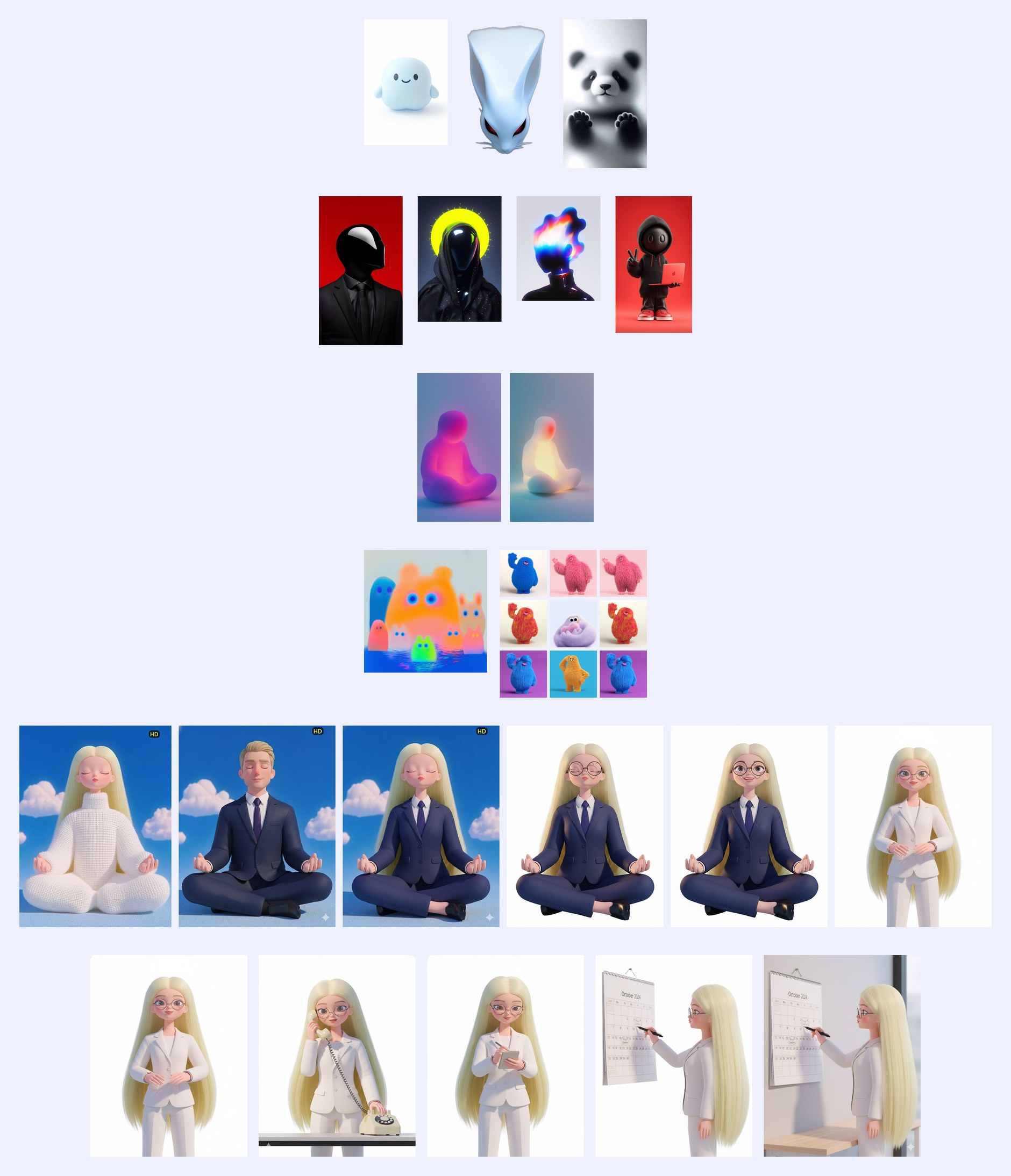
Five families. Cute mascots that say nothing about answering a customer. Faceless suited figures, competent-looking and genuinely sinister. Glowing abstract forms. Fuzzy monsters in the wrong register entirely. And a human figure, first meditating, then working. The last family won because it was the only one answering the customer's real question.
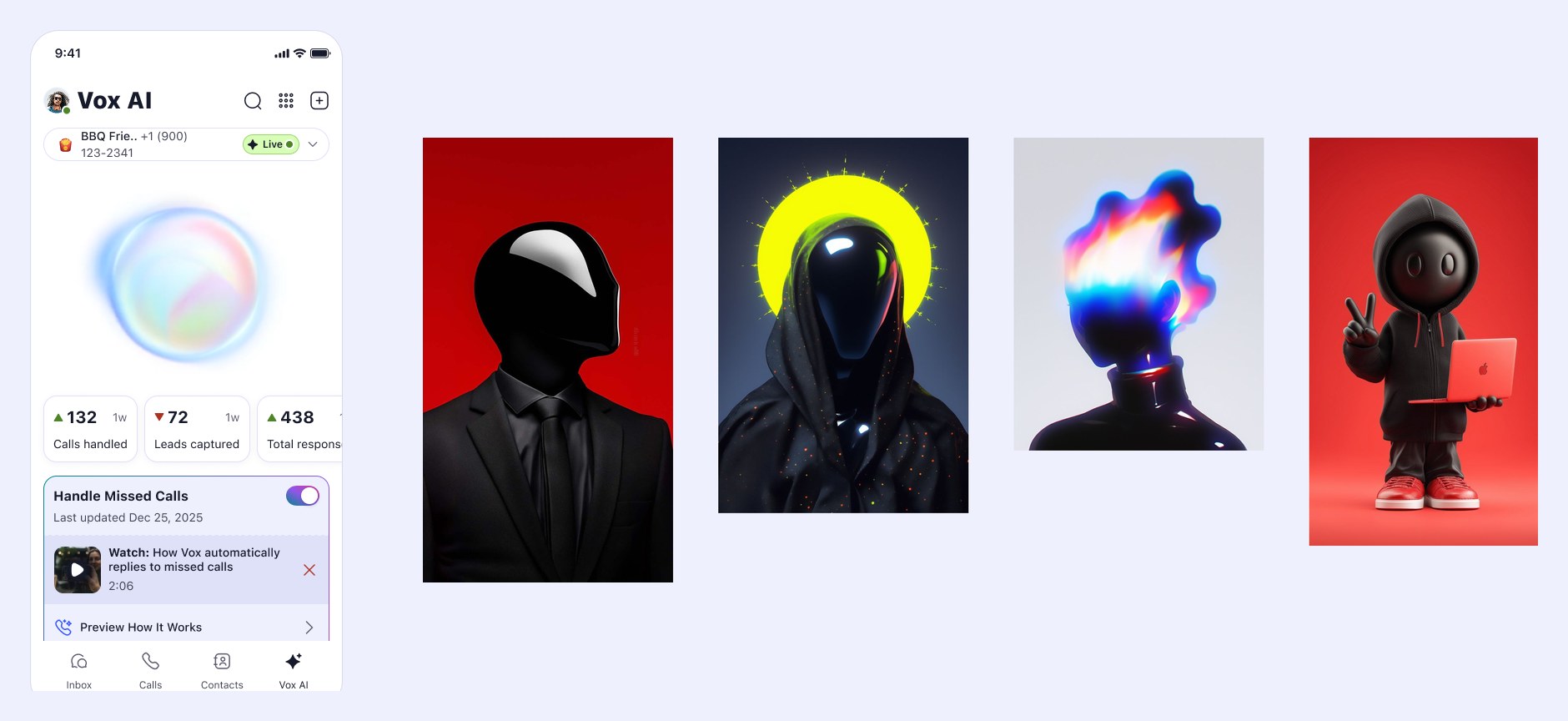
Two media, one mistake. Both are intelligence with no person attached, and both read as something watching you rather than someone helping you.
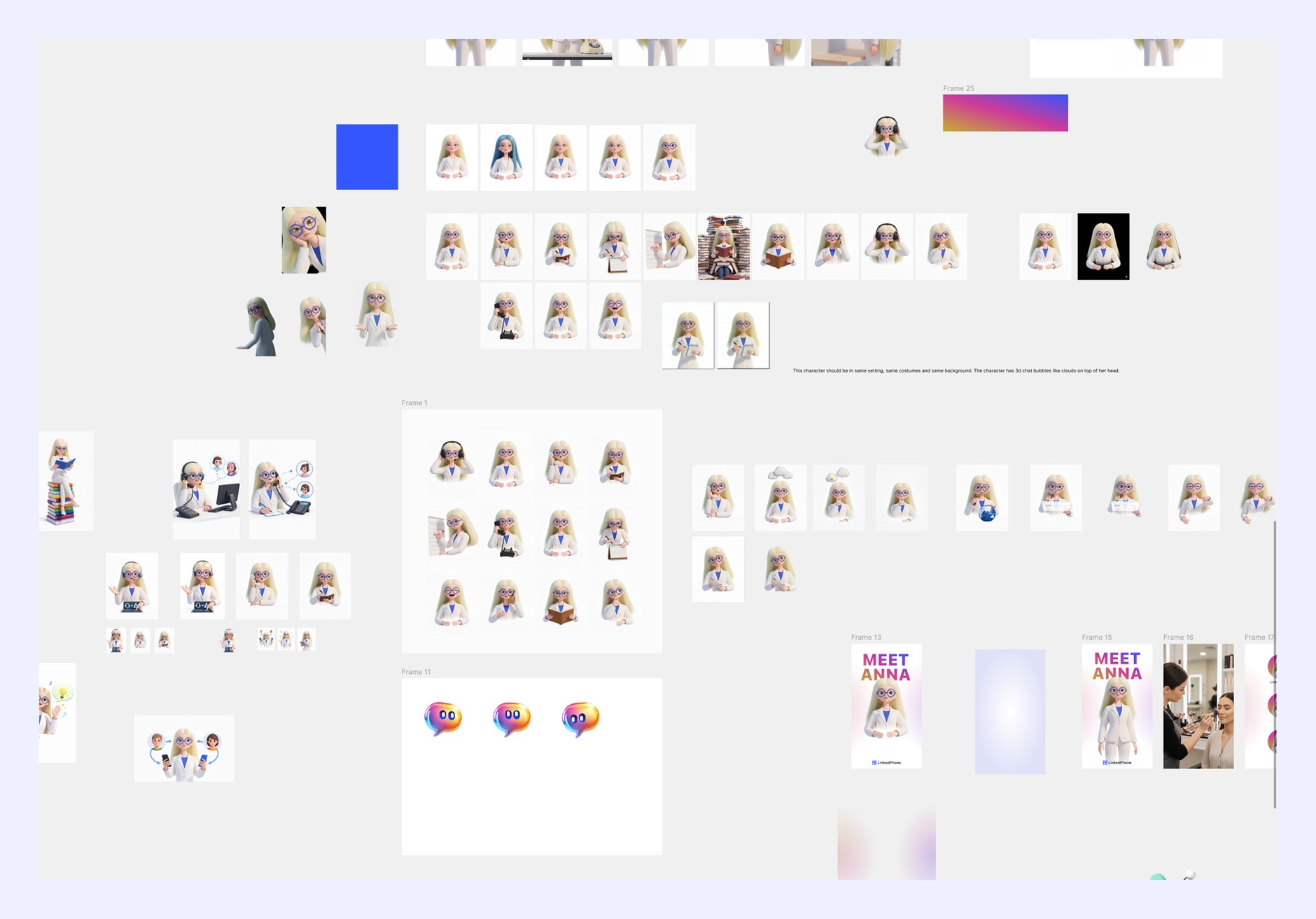
Over a hundred states: listening, thinking, reading, on the phone, at a screen. Plus an icon set built from her rather than around her. The production note pinned to the board is the whole discipline in one line: same setting, same costume, same background.
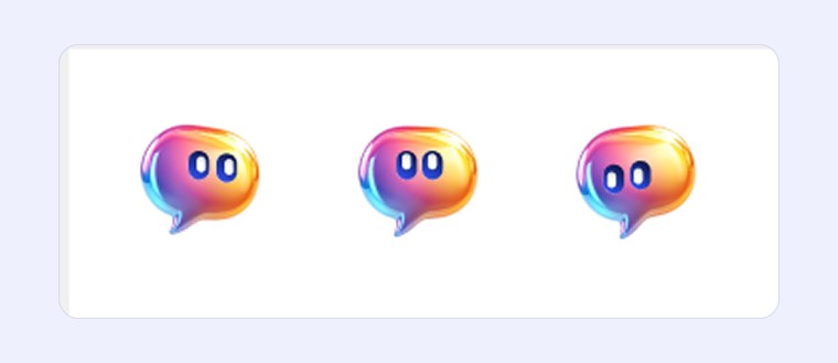
The moment the character stops being an avatar and becomes a system: the icons are made out of her, not placed next to her.
Why she looks like this
Human, but deliberately short of human.
Not too human
Testing kept pointing the same way: people found a human figure safer, friendlier and easier to approach than anything abstract. But there's a ceiling on that. Push toward photoreal and you cross into the uncanny valley, where the same familiarity starts working against you. She sits deliberately short of it: animated, familiar, unmistakably drawn. That zone also happens to be the only one where a hundred assets stay consistent without the character quietly drifting.
The blazer, because she has a job
I wanted her to read as professional and to read as interface: something that belongs in the product rather than something pasted on top of it.
The blue, used once
I tried the brand blue everywhere. Blue hair, blue eyes, a blue blazer, a blue shirt. Everything at once cancels itself out. The goggles and the shirt alone turned out to be enough to carry the brand, and keeping the rest white is what makes those two reads land. Restraint did more for recognition than saturation did.
The part worth naming
She's feminine, and that was a decision rather than a default. In testing, users consistently found the feminine character more approachable and easier to trust, which matters for a product whose whole argument is about earning permission. The research literature broadly supports that for assistance-type roles, though it is genuinely contested, and feminine-by-default assistants are fairly criticised for reinforcing a familiar stereotype.
I don't think that criticism is wrong. What I'd say is that the choice was made on evidence rather than reflex, and that it isn't the end state: character customisation is the direction, so the default stops being the only option.
Stated plainly
The character library and the films were AI-generated under my direction: mood board, brand essence, variation runs, curation, and the consistency rules that hold a hundred assets together. The direction, the selection and the system are the design work; the rendering is not.
Era 5 · The profile
Ownership language turns configuration into biography.
Rebuild the product around the character. Not a settings page. A profile.

Anna's Knowledge. Anna's Jobs. The possessive is the entire design move: not a knowledge base, hers; not enabled capabilities, her jobs.
Agents, plural
The tab said Agents because a platform of them was genuinely on the table: once the character is customisable, other agents doing other jobs follow naturally. We scoped it out for this phase. One agent, done properly, before several done thinly.
Same call for the features that appear in the early architecture and not in the shipped product: user-generated avatars, and rating and commenting on individual responses. Both were real, both were cut for scope, and both are downstream of the same decision. Finish the one she does before adding the ones she might.

A transitional file, labelled as one: the header says Lisa, the body still says Anna. It is also the first version where she has a presence in the shared inbox as a conversation thread, alongside human contacts, and where the film introducing her plays inside the product that contains her.
The name
I wrote the brief and gave away the decision.
Anna was mine. Lisa wasn't.
Naming the thing your customers will talk to is one of the most subjective decisions in a product, and subjective decisions belong with the people who carry the company's voice. So I wrote the constraint instead of the answer: two syllables, catchy, timeless rather than trendy, friendly, and carrying the character traits we had already agreed on. Then I handed it to the founders.
Anna satisfied the brief. So did Lisa. Lisa came from them, so Lisa is what shipped.
A brief that produces several right answers is a good brief. Insisting on which one gets picked isn't design. It's preference wearing design's clothes.

Route Calls arrives. Answering questions and capturing leads is a voicemail with a pulse. Transfer is what makes her part of a team, because being on a team means knowing when to hand something over.

Your AI receptionist. The job title arrives in the product's own words, Route Calls becomes Transfer Calls in the user's word rather than the system's, and the Calls tab gains a Lisa filter. Open one of those calls and you get the summary, sentiment and follow-up actions from Act 02, now produced by her. The chain closes.
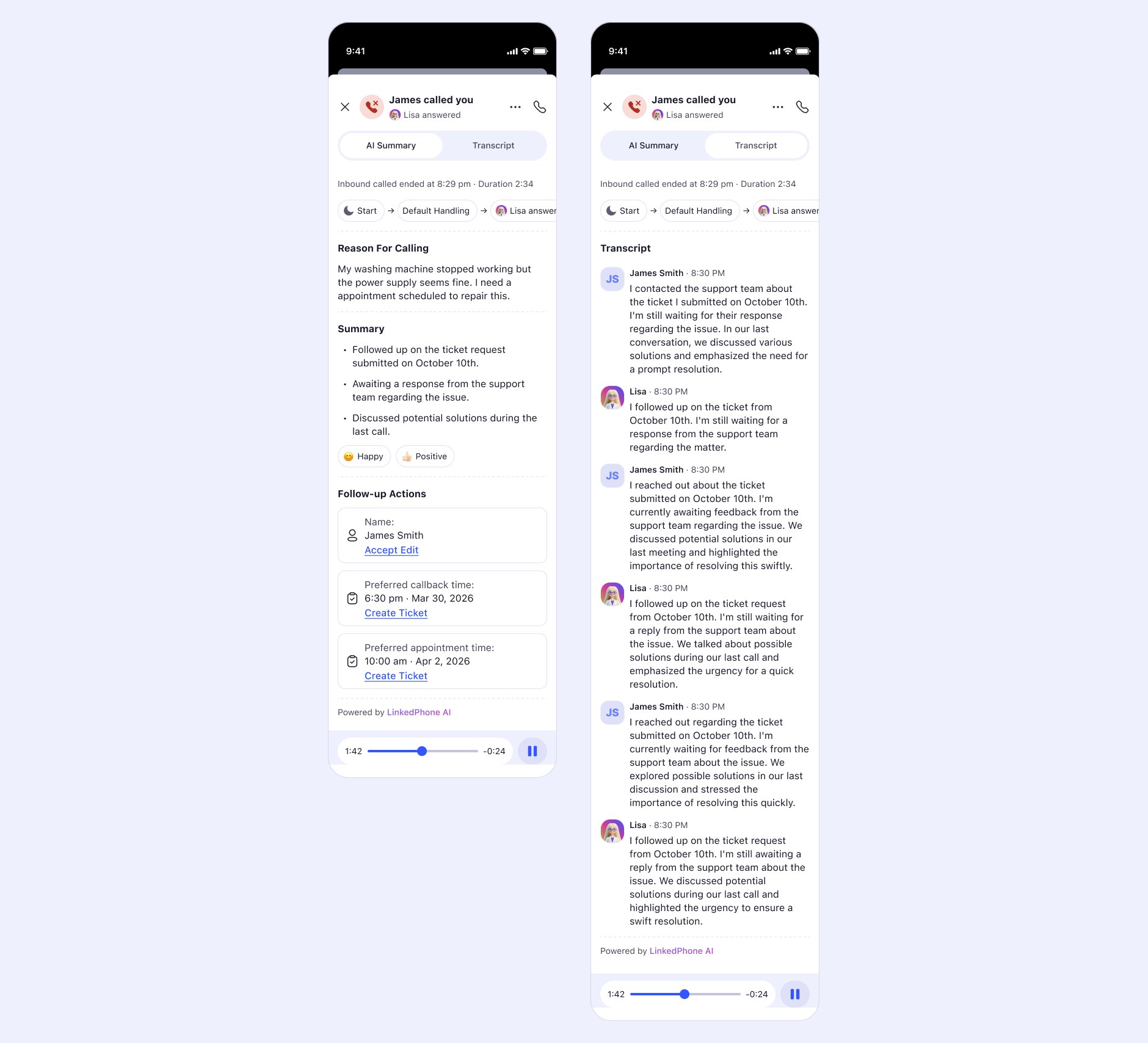
The same two screens from Act 02, with one line changed. Krishna answered and No-one answered have become Lisa answered. The summary, the sentiment and the follow-up actions are identical, because the work they do never changed. Only who took the call did.
The wall
Six eras. At least half of them failures.
That ratio is what makes the wall evidence rather than decoration.
Act 05The Breaking Point
Lisa was in beta. Real businesses were using her. Profiles were live, creation flows were running, statistics were coming back.
And the system stopped moving.
Everything had been built iteratively, each step reasonable given the one before it. That is how a structure goes patchy. Every extension was sensible; the accumulation wasn't.
The specific break was a collision. Auto Attendant lived in one part of the menu. Lisa had her own tab, put there deliberately for visibility and marketing. Two systems that answer the phone, configured in two different places, with no way for a user to understand how they related, or which one would pick up.
The information architecture couldn't express the product any more. So I stopped adding and rebuilt it.
The inversion
Auto Attendant owns the call. Lisa is one destination.
Lisa sits on all calls. Auto Attendant is what happens when she's off.
Until this point we had conceptualised Lisa as a teammate: someone Auto Attendant routes calls to. That made Auto Attendant the superset. From a product and scalability standpoint it was backwards. We tried it the other way around and it worked better.
But we didn't force the flip.
Merging Auto Attendant wholly into Lisa's configuration was the direction we explored first, and it would have broken every existing customer's setup. What shipped instead is a Setup tab where Auto Attendant is the default. Enable Lisa, for missed calls or for all calls, and her profile appears in the same place. Existing users keep what they built. Lisa-first users get Lisa. And someone who only ever wants a voicemail greeting can still do exactly that.
The inversion was the right product decision. Making it optional was the right design decision. They aren't the same decision, and shipping only the first would have been a bad launch.
The resolution
A trust ladder, expressed as a routing rule.
The ladder ran in both directions. On the user's side, nobody hands over their phone on day one. Missed-calls-only is the rung where Lisa can only improve on the status quo, because those calls were already lost. There is no downside case.
On ours, missed-calls-only was a deliberate first release, not a limitation we hadn't got round to lifting. We shipped the mode where the risk was lowest and watched whether businesses actually turned it on. They did, and kept doing it, and that adoption is what unlocked all-incoming-calls.
The middle mode isn't a compromise between two better options. It is the adoption strategy, made visible as a routing rule.
What an all-calls conversation does
The message is what happens when she can't get you a human.
That ordering is the difference between Lisa and a better voicemail. A voicemail's best outcome is a message. Lisa's best outcome is a human conversation. The interface says so in as many words: Lead Capture (Default Fallback).
How the interface got there
The state stops being a toggle and becomes a declaration.

Four of the five studies. The move that matters runs left to right: the routing becomes visible as a chain, and then the header stops being a title and becomes a sentence. Lisa Answers All Missed Calls.

The next studies. Status, setting and headline collapse into one control. The Call Handling list reorders itself per mode, so the sequence on screen matches the sequence on the call, and Performance swaps its metrics too: Missed Calls Recovered in one mode, Calls Answered in another. The screen doesn't describe the mode. It becomes it.
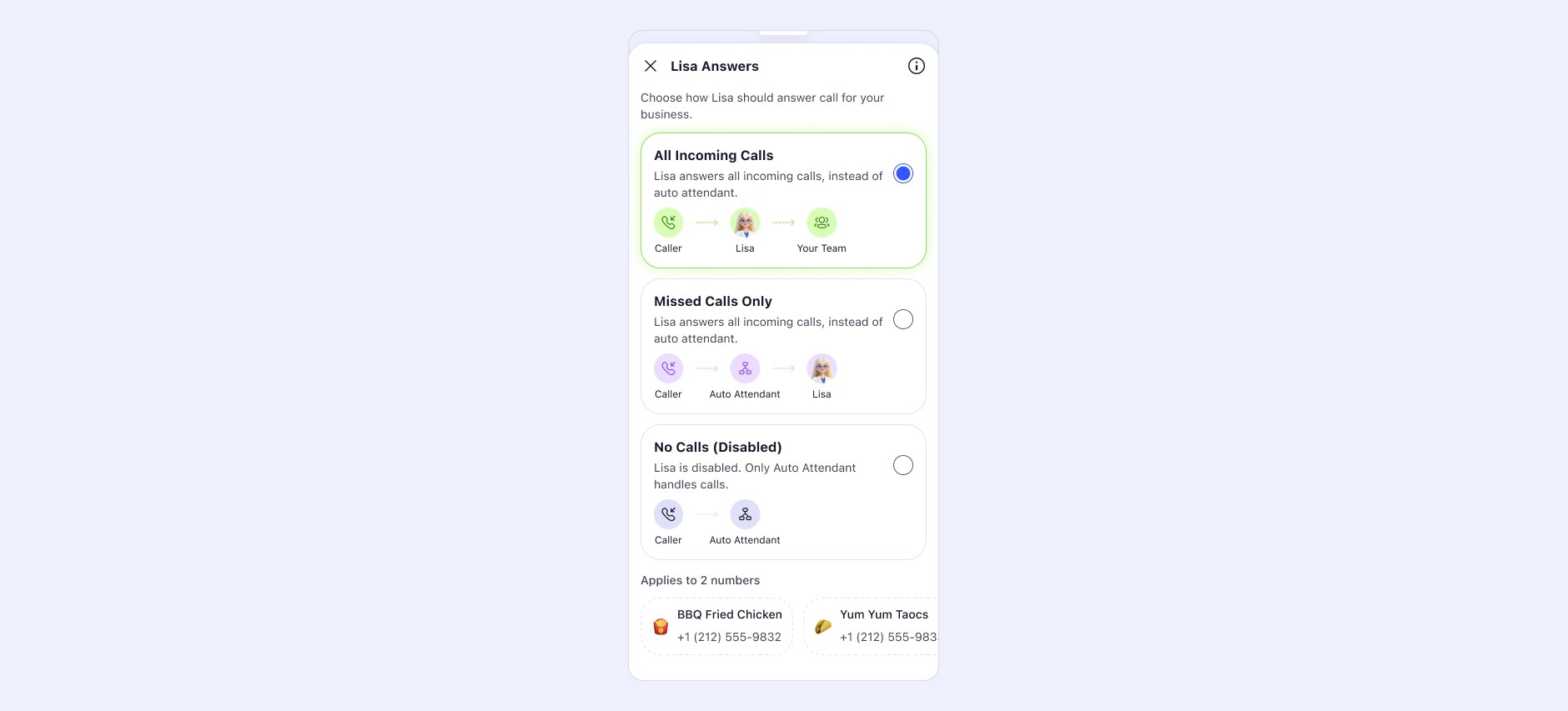
Caller → Lisa → Your Team, against Caller → Auto Attendant → Lisa. Three miniature diagrams inside a picker, doing the work a page of explanation would otherwise have to do.

The same screen in two more of its states, and underneath the picker, the business-line list. A business running three numbers sets Lisa per line: enabled on two, off on the third. The control is one thing; what it applies to is a choice.
What the structure became
An architecture for managing an agent, not configuring one.
Three blocks became three different blocks.
Call Handling
The old Handling and Jobs, merged. Business hours, which calls Lisa takes, the flow when a call comes in, and what she does once she's on it. From the user's side, what happens when someone calls was always one question, not two.
Knowledge
What she knows. Unchanged in principle since the first architecture diagram, which is the strongest evidence the original model was sound.
Performance
What she gives back. This existed in the earlier structure as one branch among six; the rebuild promoted it to a top-level block.
That promotion is the shift stated structurally. Knows and can do is an architecture for configuring an agent. Call Handling, Knowledge, Performance is an architecture for managing one. You brief her, and she reports. The tool-to-teammate move, expressed in the information architecture rather than in the copy.
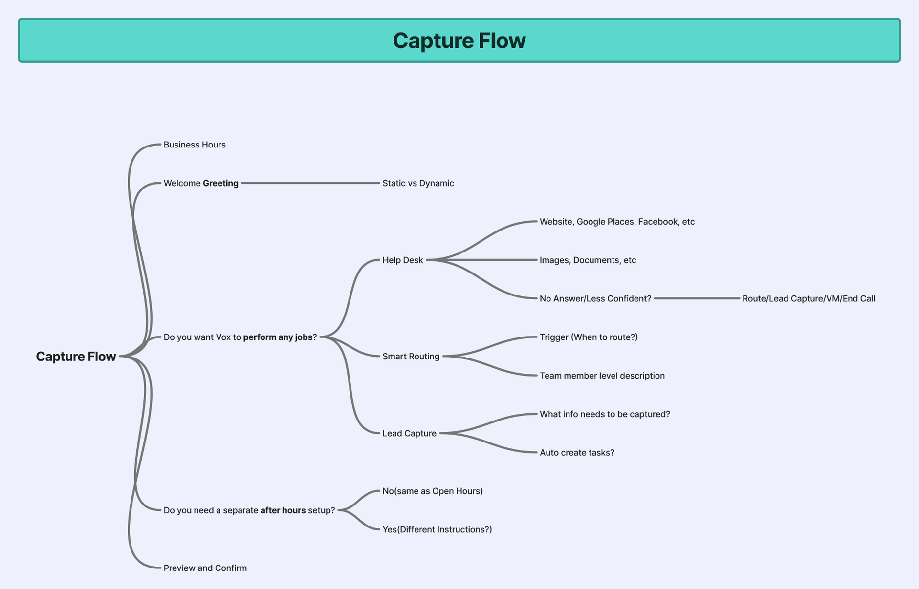
View one: the capture flow. Adding a single job propagates to all three views, so drawing them on one canvas was how I kept them honest.
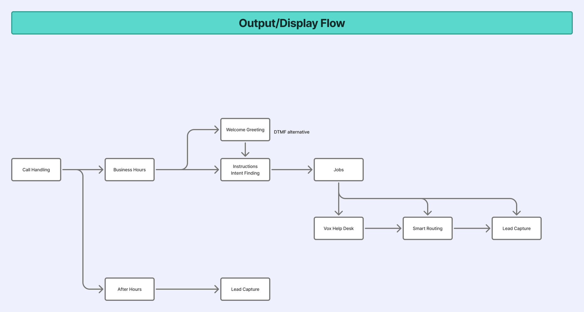
View two: the runtime flow. What the caller experiences has to be derivable from what the owner configured, or the two drift.
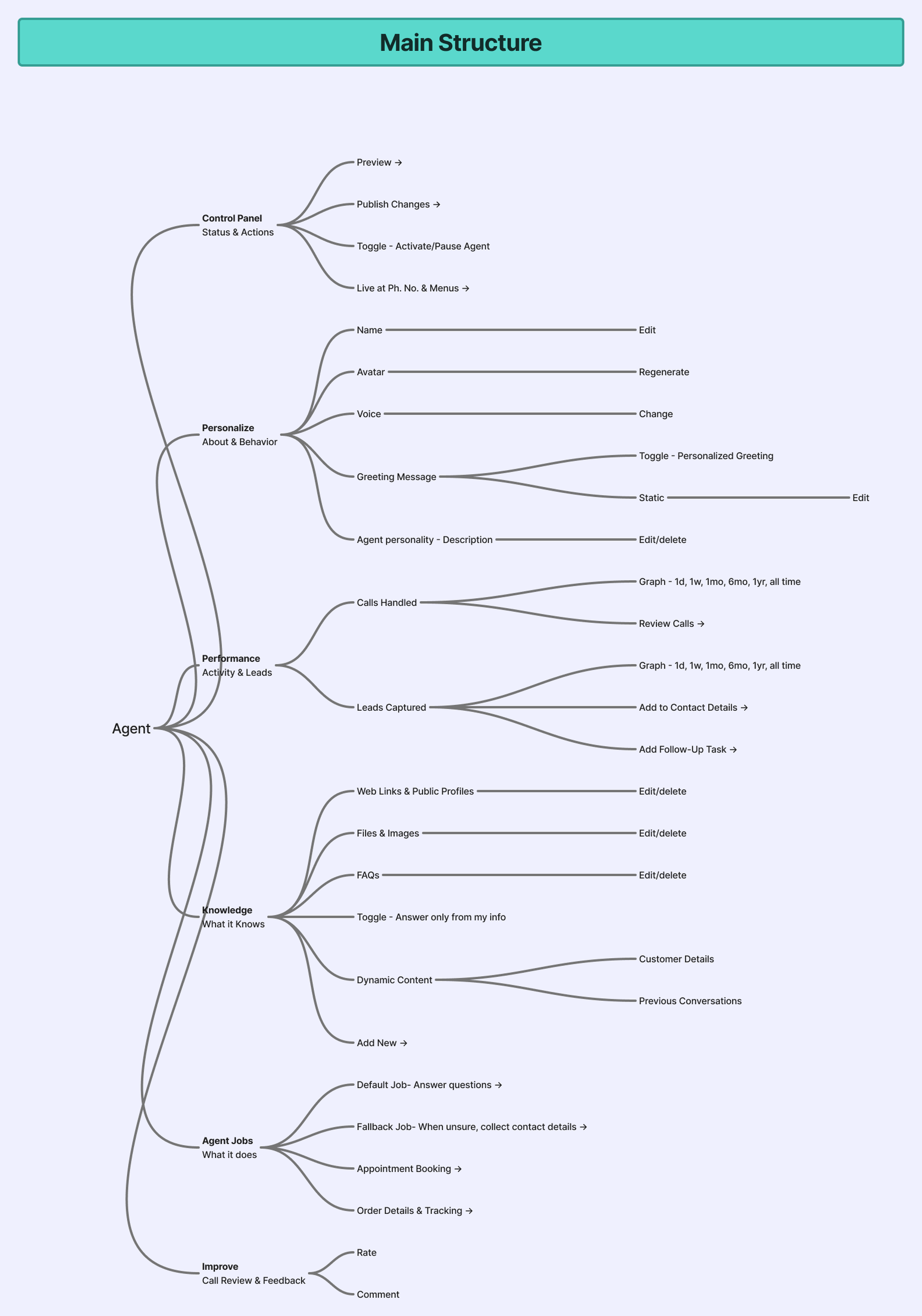
The third view: the product structure itself. Capture, runtime and structure are three descriptions of one agent, and they have to agree.
What shipped on top of it
The real test of an architecture is what it makes cheap.

Auto Attendant as the default, Lisa as the thing you switch on. Teaching happens in chat with quick-reply chips, so answering is one tap rather than a sentence, and you can ring her yourself and hear how she sounds before you ever trust her with a customer.
Why the tab says Setup
The obvious objection to everything above: this case study argues against the settings page, and the shipped tab is called Setup.
The label has to do three things. It has to be an umbrella over both Auto Attendant and Lisa, because after the inversion they are one system and can't live in two places. It has to fit a bottom-nav item. And it has to not collide with Settings, which already exists and means something else.
We tried a lot of alternatives. Setup is the one that survived: short enough for the nav, broad enough to hold both, and specific enough that nobody confuses it with account preferences.
The tab is the container. Lisa is what's inside it, and what's inside it is still a profile.

The handling list reorders, the metrics change, and the flow diagram in the picker shows you exactly who answers first. Nothing here is a settings toggle. Every control is a description of what will happen to a caller.

Voice, personality, greeting instructions, and a business owner's own voice cloned from about thirty seconds of reading.
The safeguard on the clone
Cloning uses a randomly generated passage, different every time. You can't submit a recording you already had, and you can't reuse someone else's audio: the system asks for words nobody could have anticipated, read now.
It's a liveness check, not an identity check. It establishes that someone is speaking in the moment rather than replaying a file. For a feature whose whole point is letting a business owner lend their own voice to their own line, that's the right level of friction: enough to close the obvious hole without turning a thirty-second setup into an identity verification flow.
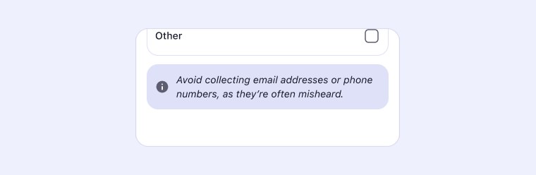
Avoid collecting email addresses or phone numbers, as they're often misheard. Not buried in help documentation, and not a warning after the fact: it sits at the exact moment the user is choosing what to ask callers for.

What she is once setup is over. A thread in the shared inbox beside the human contacts. A call you can place to her yourself. A knowledge base you can browse and add to. And transfers that resolve to named people on a real team, which is the difference between an answering machine and a colleague.
The payoff
No answer → Lisa. Press 4 → Lisa.

On the left, the first era: the AI sitting in one Voicemail slot of one menu branch. On the right, the shipped tree. The same structure, opening this case study and closing it, with the relationship inverted.

Not how well she scored, but what happened. Answered and resolved, transferred, lead captured, and what customers actually kept asking about.
Act 06In the World
The character system
In some versions the illustrations replaced the icon set entirely.
Over a hundred assets: states, headers, character animations, icons. Lisa doing the work an icon would otherwise do.

The consistency rules are what make this a system rather than a folder: same setting, same costume, same background, so any state can stand in for any other without the product looking like it changed hands.
The films
The product decision and the marketing decision were the same decision.
Four to five marketing reels, and four to five product, explainer and tutorial films. Some I directed, produced and edited end to end; on others I directed and mentored the team.
Here is the loop worth naming. Because Lisa was designed as an AI character rather than a photographed person or an abstract mark, producing video of her cost almost nothing. So she could present herself: a vertical “hire me” bio in which Lisa introduces her own capabilities.
Made once, in Act 04. Paid for twice.
Two of the vertical films, muted until you turn them on. Because Lisa is a character rather than a person on camera, producing them cost almost nothing, so she could introduce herself and then walk a new owner through her own setup. The product decision and the marketing decision were the same decision, made once.
The product page
For an AI product, the objection list is the funnel.
I built the LinkedPhone site, so the launch surface was mine too.
The page's argument, in order: social proof first, more than 50,000 businesses and 4.7 across 4.8K reviews, then three plain benefits, then capability, then a three-step setup, then a named customer, then a long FAQ.
The FAQ is long on purpose. Every answer retires one specific fear. Can I turn her off? Does she get better? Who does she transfer to? Will she book appointments?
And the through-line: the page sells the outcome, never the model.
That is the first research finding, carried intact from a field interview to a pricing page. Nobody wakes up wanting AI.
Ripple Effects
The work outlived its own feature.
Act 07What It Changed
Impact
Missed calls first. Then all of them.
That sentence is the impact, and the second half was conditional on the first.
Beta ran for three months, widening in rounds. The first cohort, then a thousand more people, then ten percent of the user base, then general release.
For almost the entire beta, only one mode existed.
Missed calls only. Every round, every cohort, every piece of feedback came from businesses letting Lisa take the calls they had already lost: the rung with no downside case. All-incoming-calls didn't open until the final ten-percent phase.
That wasn't caution for its own sake, and it wasn't engineering readiness. It was the trust ladder applied to the rollout itself. We earned the right to ask for every call by first proving we could be trusted with the ones already gone, and the businesses in that beta made the same judgement, in the same order, that the interface asks each new user to make.
The mode isn't a feature tier. It's the adoption strategy, tested as one before it shipped as one.
Three months, four rounds. The mode that asks for everything was the last thing to open, because it had to be.
A staged rollout that actually advanced is the outcome. The gate was real, it was structural, and it was passed.
Lessons
What I believed. What I learned.
Lesson 01
I believed showing an AI's confidence would build trust.
The first version put Response Quality and Caller Satisfaction on the home screen, out of a hundred. Quantified doubt reads as risk. The completeness score now runs the agent's behaviour and never appears in the interface.
Lesson 02
I believed presence was enough.
Two eras of particle fields and orbs were beautiful and felt like being watched. Expressive abstraction reads as intelligence observing you; a face reads as someone helping you.
Lesson 03
I believed capability made a teammate.
Answering questions and capturing leads is a better voicemail. Transfer, knowing when to hand over to a human, is what made Lisa part of the team rather than a substitute for it.
Lesson 04
I believed iterating carefully was enough.
Every extension was reasonable; the accumulation wasn't. I now re-audit the information architecture against the interface on a cycle, instead of waiting for it to stop moving.
Legacy
A summary after the call, then a suggestion during it, then a voice inside it.
Lisa began as an experiment layered on top of phone calls.
She ends as the first thing a caller meets. And as the first time LinkedPhone stopped asking how do we manage communication? and started asking how do we represent a business when nobody is available?
Closing
The design problem was never the AI. It was making someone willing to hand over their phone, and then earning the right to ask for the rest of them.